When dealing with numbers in statistics, incorporating data visualization is integral to creating a readable and understandable summary of a dataset. It doesn’t matter if it’s a large or small dataset, visualizing data using graphs and charts will contribute largely to your audience understanding the message.
There are, however, numerous types of graphs and charts used in data visualization and it is sometimes tricky choosing which type is best for your business or data. Each of these graphs has its own strengths and weaknesses that make it better than others in some situations.
You may need to visualize the outcome of scientific research, a sales report, an industry infographic, or a pitch deck demographic. Graphs and charts are easy ways of showcasing each of these content.
What is a Graph?
A graph is a pictorial representation of data in an organized manner. Graphs are usually formed from various data points, which represent the relationship between two or more things.
A picture says a thousand words, they say. A graph, on the other hand, not only says a thousand words but also tells a million stories.
Each point, stroke, color, or shape on a graph has a different meaning that helps in interpreting a graph. They are of different types and vary in structure, with some having just points, others have points joined together by lines, and so on.
Graphs and Charts – What is the Difference?
Although sometimes used interchangeably, it is important to note that there is a difference between graphs and charts. Summarily, we can say that all graphs are charts but not all charts are graphs.
A graph is a mathematical diagram that depicts the relationship between two or more sets of numerical data over a period of time. Basic data is mainly 2-dimensional with a focus on raw data represented through lines, curves, etc.
Charts, on the other hand, is a representation of datasets with the intent of making the user understand the information in a better manner. Graphs are a good example of charts used for data visualization.
Types of Graphs and Charts
There are various types of graphs and charts used in data visualization. However, in this article, we’ll be covering the top 11 types that are used to visualize business data.
Bar Chart/Graph
A bar chart is a graph represented by spaced rectangular bars that describe the data points in a set of data. It is usually used to plot discrete and categorical data.
The horizontal axis of the chart represents categorical data while the vertical axis of the chart defines discrete data. Although the rectangular bars in a bar chart are mostly placed vertically, they can also be horizontal.
For horizontally placed rectangular bars, the categorical data is defined on the vertical axis while the horizontal axis defines the discrete data.
Types of Bar Chart
- Grouped Bar Chart
Grouped bar charts are used when the datasets have subgroups that need to be visualized on the graph. Each subgroup is usually differentiated from the other by shading them with distinct colors.
- Stacked Bar Chart
The stacked bar graphs are also used to show subgroups in a dataset. But in this case, the rectangular bars defining each group are stacked on top of each other.
- Segmented Bar Chart
This is the type of stacked bar chart where each stacked bar shows the percentage of its discrete value from the total value. The total percentage is 100%
Advantages of a Bar Chart
- Summarizes a large amount of data in an understandable form.
- Easily accessible to a wide audience.
Disadvantages of a Bar Chart
- It does not reveal key assumptions like causes, effects, patterns, etc.
- May require further explanation.
Pie Chart
A pie chart is a circular graph used to illustrate numerical proportions in a dataset. This graph is usually divided into various sectors, where each sector represents the proportion of a particular numerical element in the set.
Just like a pizza is divided into different slices, each sector in a pie chart represents the proportion of an element in the dataset. The proportion is defined by the degree of the sector and the percentage area with respect to the area of the circle.
Types of Pie Chart
- Simple Pie Chart
This is the most basic type of pie chart and can also be simply called a pie chart.
- Exploded Pie Chart
In an exploded pie chart, one of the sectors of the circle is separated (or exploded) from the chart. It is used to lay emphasis on a particular element in the data set.
- Pie of Pie
As the name suggests, a pie of pie is a chart that generates an entirely new (usually small) pie chart from the existing one. It can be used to reduce clutteredness and lay emphasis on a particular group of elements.
- Bar of Pie
This is similar to the pie of pie, with the main difference being that a bar chart is what is generated in this case rather than a pie chart.
- 3D Pie Chart
This is a type of pie chart that is represented in a 3-dimensional space.
Uses of Pie Chart
- It summarizes data into a visually appealing form.
- It is quite simple compared to many graph types.
Disadvantages of Pie Chart
- It is inapplicable for large datasets.
- It cannot visualize groups of data.
Line Graph or Chart
Line graphs are represented by a group of data points joined together by a straight line. Each of these data points describes the relationship between the horizontal and the vertical axis on the graph.
The graph may ascend, descend, or do both depending on what kind of data is being visualized. When studying the relationship between price and supply, it goes down and for peace and demand, it goes up.
When constructing a line chart, you may decide to include the data points or not.
Types of Line Graph
- Simple Line Graph
In a simple line graph, only one line is plotted on the graph. One of the axes defines the independent variables while the other axis contains dependent variables.
- Multiple Line Graph
Multiple line graphs contain two or more lines representing more than one variable in a dataset. This type of graph can be used to study two or more variables over the same period of time.
- Compound Line Graph
A compound line graph is an extension of the simple line graph, which is used when dealing with different groups of data from a larger dataset. Each line in a compound line graph is shaded downwards to the x-axis.
In a compound line graph, each group of data represented by a simple line graph is stacked upon one another.
Uses of a Line Graph
- It helps in studying data trends over a period of time.
- They are easy to read and plot.
Disadvantages of a Line Graph
- It can only be used to visualize data over a short period of time.
- It is not convenient to plot when dealing with fractions and decimals
Histogram Chart
Histogram chart visualizes the frequency of discrete and continuous data in a dataset using joined rectangular bars. Each rectangular bar defines the number of elements that fall into a predefined class interval.
Types of Histogram Chart
The histogram chart is classified into different parts depending on their distribution
- Normal Distribution
A normally distributed histogram chart is usually bell-shaped. As the name suggests, this distribution is normal and is the standard for how a normal histogram chart should look like.
- Bimodal Distribution
In a bimodally distributed histogram chart, we have two groups of histogram charts that are of normal distribution. It is formed as a result of combining two processes in a dataset.
- Skewed Distribution
This is an asymmetric graph with an off-center pick usually tending towards the end of the graph. A histogram chart can be said to be right or left-skewed depending on the direction where the peak tends towards.
- Random Distribution
This type of histogram chart does not have a regular pattern. It produces multiple peaks and can also be called a multimodal distribution.
- Edge Peak Distribution
This distribution has a structure that is similar to that of a normal distribution with a large peak at one of its edges being the distinguishing factor.
- Comb Distribution
The comb distribution has a “comb-like” structure, where the rectangular bars alternate between tall and short.
Uses of Histogram Chart
- It helps in visualizing large amounts of data.
- It reveals the variation, centering, and distribution of the data.
Cons
- It does not visualize the exact values in a dataset.
- It only visualizes continuous data.
Area Chart
Area charts are used to collectively measure data trends over a period of time by coloring the area between the line segment and the x-axis. In simpler terms, an area chart is an extension of the line chart.
Types of Area Chart
- Simple area Chart
In a simple area chart, the colored segments overlap each other in the chart area. They are placed above each other such that they intersect.
- Stacked Area Chart
In a stacked area chart, the colored segments are stacked on top of one another so that they do not intersect.
- 100% Stacked area Chart
This is a type of stacked area chart where the area occupied by each group of data on the chart is measured as a percentage of its amount from the total data. The vertical axis usually totals a hundred percent.
- 3-D Area Chart
This is the type of area chart measured on a 3-dimensional space.
Uses of Area Chart
- It is visually appealing.
- It gives a clear comparison of different groups of data.
Cons
- It may be difficult to read when compared to other data types.
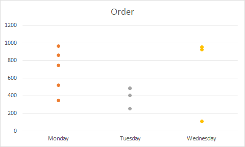
Dot Graph or Plot
A dot plot is a type of graph with data points, which are vertically represented by dot-like markers. It is said to be similar to the histogram chart and bar chart because the height of the aggregation of each group of the dot-like markers is equal to the frequency of the elements in a particular class interval.

Types of Dot Plot
- The Wilkinson Dot Plot
This type of dot plot uses the local displacement to prevent the dots on the plot from overlapping. This dot lot was created by Leland Wilkinson.
- Cleaveland Dot Plot
This is a scatterplot-like chart that displays data vertically in one dimension. It was developed by William Cleaveland.
Pros
- They are usually very colorful and visually appealing.
Cons
- The data points clutter and become unreadable when dealing with large datasets.
- It is usually difficult to read frequency from the chart
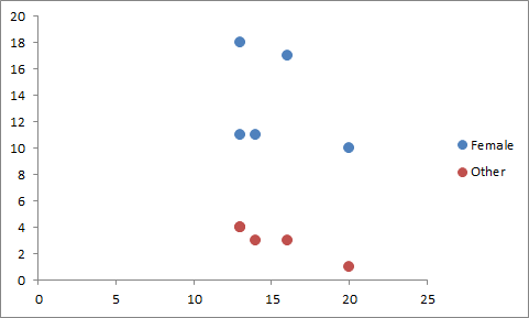
Scatter Plot
Scatter plots are charts used to visualize random variables with dot-like markers that represent each data point. These markers are usually scattered across the chart area of the plot.

Types of Scatter Plot
Scatter plots are grouped into different types according to the correlation of the data points. These correlation types are highlighted below
- Positive Correlation
Two groups of data visualized on a scatter plot are said to be positively correlated if an increase in one implies an increase in the other. A scatter plot diagram can be said to have a high or low positive correlation.
- Negative Correlation
Two groups of data visualized on a scatter plot are said to be negatively correlated if an increase in one implies a decrease in the other A scatter plot diagram can be said to have a high or low negative correlation.
- No Correlation
Two groups of data visualized on a scatter plot are said to have no correlation if there is no clear correlation between them.
Pros
- It clearly shows data spread
- Ir is usually colorful and visually appealing
Cons
- It cannot give the exact extent of correlation.
- It can only be used to study the relationship between 2 variables.
Bubble Chart
A bubble chart is a multivariable graph that uses bubbles to represent data points in 3 dimensions. It represents data points with bubbles, with the first two variables determining the location of the bubble on the x and y-axis while the 3rd variable determines the size of the bubble.
Types of Bubble Chart
Bubble Charts are divided into different parts according to the number of variables in the dataset, type of data it visualizes, and he number of dimension the graph is.
- Simple Bubble Chart
The simple bubble chart is the most basic type of bubble chart and is equivalent to the normal bubble chart.
- Labeled Bubble Chart
The bubbles on a labeled bubble chart are usually labeled for easy identification, particularly when dealing with different groups of data.
- Multivariable Bubble Chart
In a multivariable bubble chart, the variables in the dataset are usually more than 3 (particularly 4). Therefore, the fourth variable is usually distinguished with color.
- Map Bubble Chart
A map bubble chart is usually used to illustrate data on a map.
- 3D Bubble Chart
This is a bubble chart designed on a 3-dimensional space. The bubbles on a 3D bubble Chart are spherical.
Uses of Bubble Chart
- It can visualize up to 4-dimensional data.
- It is visually appealing
Cons
- It is not good for visualizing large data.
- It may be difficult to ascertain specific values at a glance.
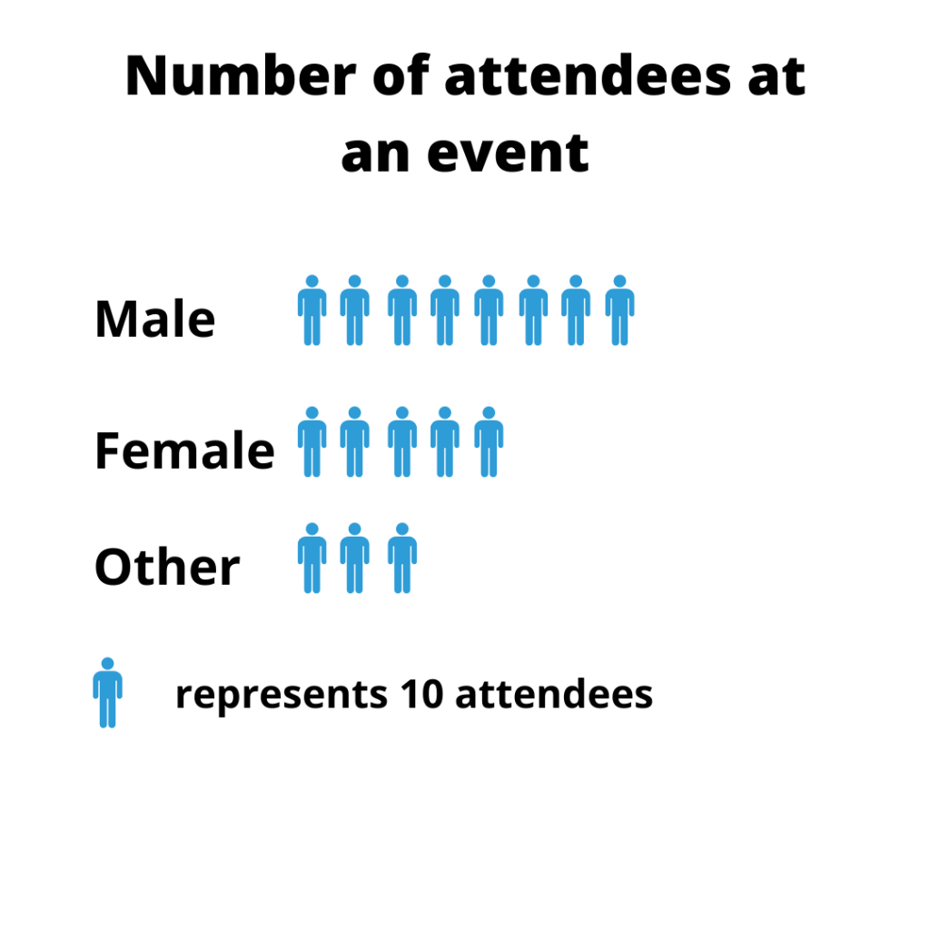
Pictogram Graph
A pictogram graph uses pictures or icons to visualize a small dataset of discrete data. In a pictogram, the icon represents a predefined unit and describes the frequency of the variables in the dataset.

Pros
- It is great for finding weight.
Cons
- The data between points cannot be determined.
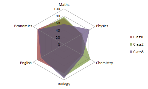
Radar Chart
A radar chart is a graphical method used for displaying multivariate data in the form of a two-dimensional chart of three or more quantitative variables represented on axes starting from the same point. (Source: Wikipedia). It is also called the spider graph.

Types of Radar Chart
- Simple Radar Chart
This is the most basic type of the radar chart and is equivalent to the normal radar chart. It consists of a sequence of radii drawn from the center point and joined together.
- Radar Chart With Markers
For radar charts with markers, each data point on the spider graph are marked
- Filled Radar Chart
In the filled radar charts, the empty space between the lines and the center of the spider web is colored.
Uses of Radar Chart
- It can be used to compare multiple unrelated variables in a dataset.
- The outliers are easily noticeable.
Cons
- It is not good for large datasets.
- It has limited uses in data analysis.
Spline Chart
A spline chart is a type of line chart where data points are joined together by a smooth curve.
Pros
- They can be easily drawn
- It can visualize quadratic functions and polynomials
Cons
- It is not convenient to plot when dealing with fractions and decimals.
How to Use Collect Online Data for Graphs & Charts with Formplus
Follow the following simple steps to collect online data for your graphs and charts using Formplus.
Create an online form
To create a new survey on Formplus, go to Forms in the top menu, then click on the Create Form button.
Alternatively, you can go to your Dashboard, then click on the Create new form button.
Collect Data For Your Graph
After creating your survey, choose any of the available form fields in the left sidebar of the Form builder. Select the form field required to collect information for your graph by clicking or dragging and dropping it on the live preview section.


![11 Types of Graphs & Charts + [Examples] 11 Types of Graphs & Charts + [Examples]](https://storage.googleapis.com/fplsblog/1/2020/11/area-chart.png)


