Learn how to use Python to fetch and analyze search query data from Google Search Console and estimate its potential for high traffic content production.
Isolating the 15% Unknown Queries
When we fetched our Search Console query dataset, we made sure to pull the dates, which will allow us to perform powerful analyses with ease.
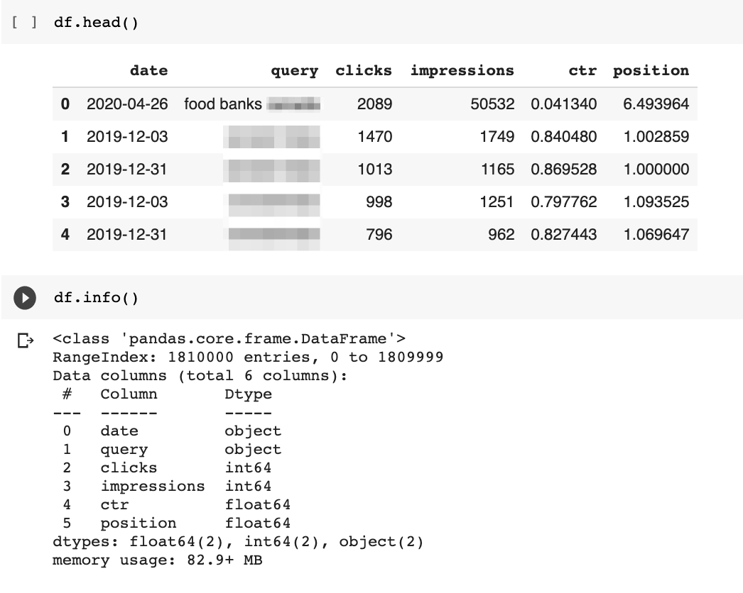
But first, we need to change the data type of the date column.
As you can see above, it was not automatically detected as a datetime object.
The following code uses the pandas function to_datetime to fix that.
df["date"] = pd.to_datetime(df.date)
Now, we can narrow down our dataset to find 15% of unknown queries to show up each day.
Google likely compares daily queries with all previously known ones.
Given our limited dataset, we will only compare with queries seen in the last year.
Here is our process to do that:
- Create a filtered data frame with just the last day of data collected. Search Console takes a couple of days to update.
- Create two sets of unique queries: one with the last day queries and another with the remaining queries over the last year.
- Create a new set of unknown queries by calculating the difference between the previous datasets.
The last day of data in my dataset is Nov 7.
I can filter the data frame by looking for dates greater than Nov 6.
Super simple!
df[df["date"] > "2020-11-6"]
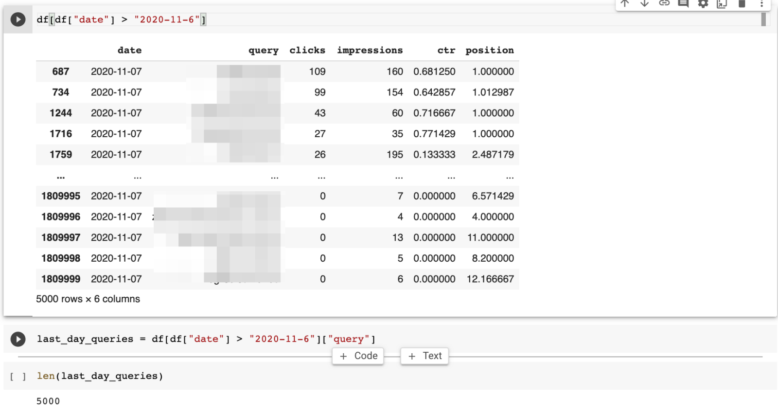
This returns 5k rows of query data.
I can use the same approach to get another dataset with the rest of the queries.
rest_of_queries = df[df["date"] < "2020-11-6"]["query"]
I get 180k queries in my dataset.
Calculating the unknown queries is very simple using Python Sets.
fifteen_percent = set(last_day_queries) - set(rest_of_queries)

last_day_queries = df[df["date"] > "2020-11-01"]["query"]
When I counted the keywords, I only found 212, which is less than 4% of the queries for the day.
It was not 15%, but the number of queries is enough to find new content ideas.
The site I ran this analysis on is a big non-profit, and it was interesting to manually review the unknown queries.
Here are some of the query patterns I discovered.
- Queries related to business names that seem to be recently opened or recently getting attention.
- Some appear to be news-driven.
- New situations in the world.
Let’s review three example queries.
New Situation in the World

New business?
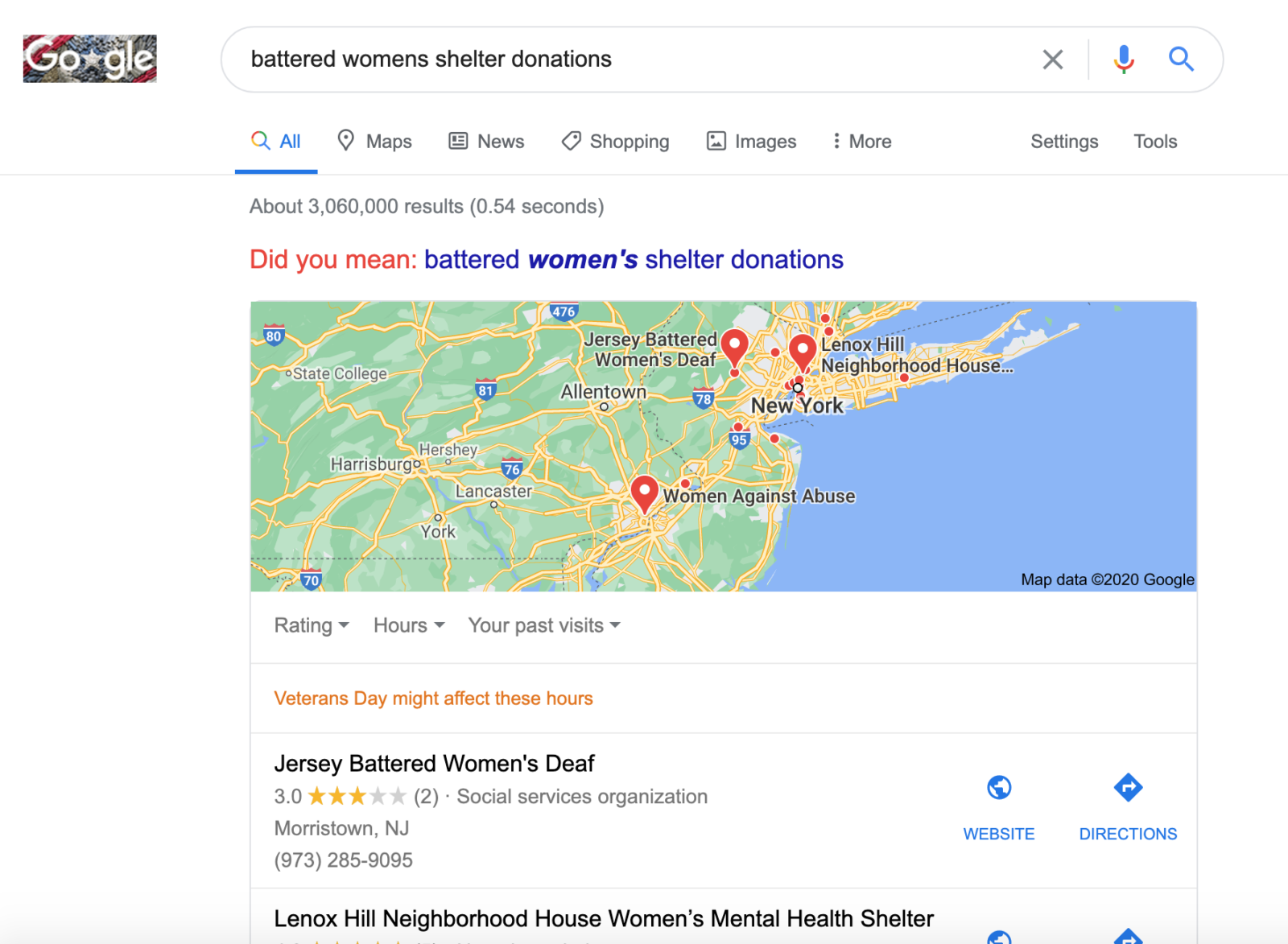
Google didn’t find this business in my search, but look how Google determined it was a local search.
Maybe the business is in another geographical location.
News-Driven
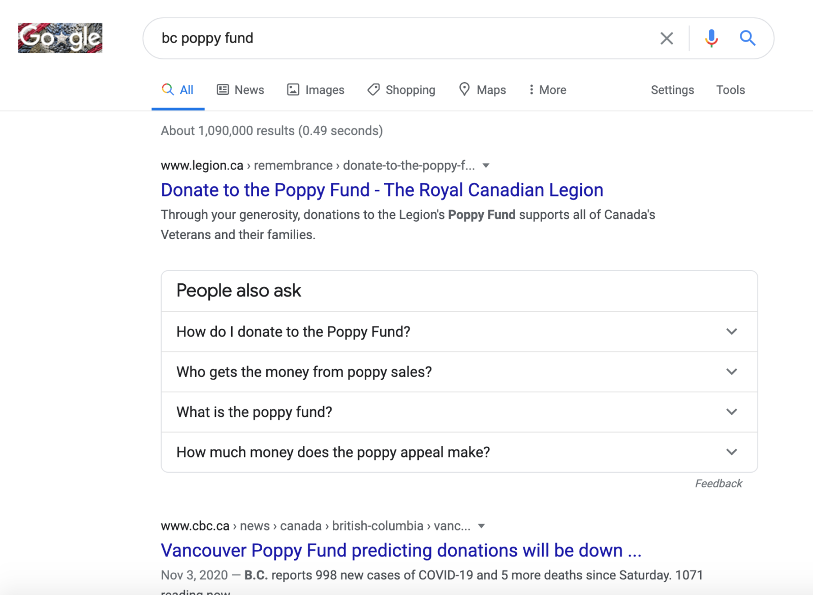
I found this one to be particularly interesting.
You can see in the SERPs a news report of November 3 mentioning lower donations in B.C.
It makes sense that searches would spike to learn more about it.
Do you see how this technique could help discover new content opportunities?
Really powerful stuff!
Semantically Matching Queries
So, we have a number of new queries and corresponding content ideas.
But, we don’t have historical performance to gauge each opportunity.
As these queries are potentially never seen before, they are unlikely to show up in keyword tools.
How do we know which ones to prioritize?
Here is one clever technique we can try.
We are going to borrow an idea from this patent analysis post from sensei Bill Slawski.
The patents he discusses talk about canonical queries.
Canonical queries imply there are duplicate ways to write the same search.
While the patents focus on syntactical duplication, we can expand the concept and consider semantic duplication as well.
Queries that mean the same, but are expressed using different words.
Bill covered another patent that takes this approach.
But, how would we check for that?
Using machine learning, of course!
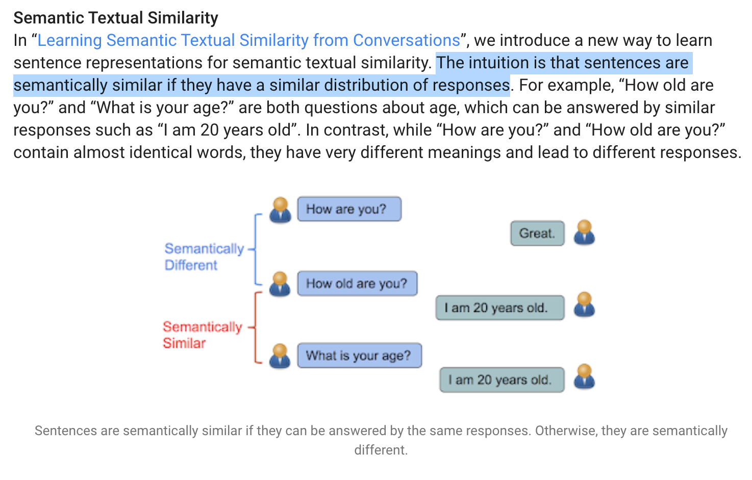
Semantic textual similarity is an advanced concept, but I love the simple visualization and explanation in this article.
It shows one approach to find similar queries/questions is to match them by their responses.
If the answer is consistently the same, it is likely we are asking equivalent questions!
Now, let’s translate this idea into Python code.
First, let’s install this handy library.
!pip install sentence-transformers
We can build a model with a couple of lines of code.
from sentence_transformers import SentenceTransformer, util

model = SentenceTransformer('distilbert-base-nli-stsb-mean-tokens')
Once we have a model, we will find semantically similar queries by following the following process:
- Turn the queries/sentences into embeddings (numbers that simplify proximity calculations)
- Calculate proximity scores between pairs of queries.
- Filter the closest matches based on a cutoff threshold we can determine empirically.

In the screenshot above, you can see how powerful this matching technique is.
“The new movie is awesome” and “the new movie is so great” are perfect matches at 0.98.
The highest score is 1.
Here is the code to do this with our queries.
First, we create the embeddings.
fifteen_percent_list = list(fifteen_percent)
#Compute embedding for both lists

embeddings1 = model.encode(fifteen_percent_list, convert_to_tensor=True)
# try on a smaller set of 10k, as it takes too long to run on full set of queries

rest_of_queries_list = list(set(rest_of_queries))[:10000]
embeddings2 = model.encode( rest_of_queries_list, convert_to_tensor=True)
Next, we want to find semantically similar queries in the historical list that closely match the new unknown queries.
#Compute cosine similarities

cosine_scores = util.pytorch_cos_sim(embeddings1, embeddings2)
Finally, here is the code to filter the similar queries.
#Output the pairs with their score

for i in range(len(fifteen_percent_list)):

  score = cosine_scores[i][i]

  if score > 0.7:

    print(f"{i}. {fifteen_percent_list[i]} <> {rest_of_queries_list[i]} \nScore: {score:.4f}")
I was only able to check 10,000 queries and there were no matches above 0.5.
I will try later with the full dataset and report the outcome on Twitter.
Please feel free to report what you get in your experiments.
Prioritizing the Most Promising Ideas
When I visually inspected the unknown queries, I found a couple of interesting patterns worth investigating further.
One about fundraising ideas and another about [no-profit] near me.
Let’s use a data-driven approach to evaluate the potential impact of each one with visualization and forecasting.
First, I’m going to create two filtered data frames where the query contains the pattern keyword.
ideas_df = df[df['query'].str.contains("idea")]
near_me_df = df[df['query'].str.contains("near me")]
We are going to set the date column as the index of the data frame.
This will enable us to perform advanced groupings by days or months.
ideas_df = ideas_df.set_index("date")
near_me_df = near_me_df.set_index("date")
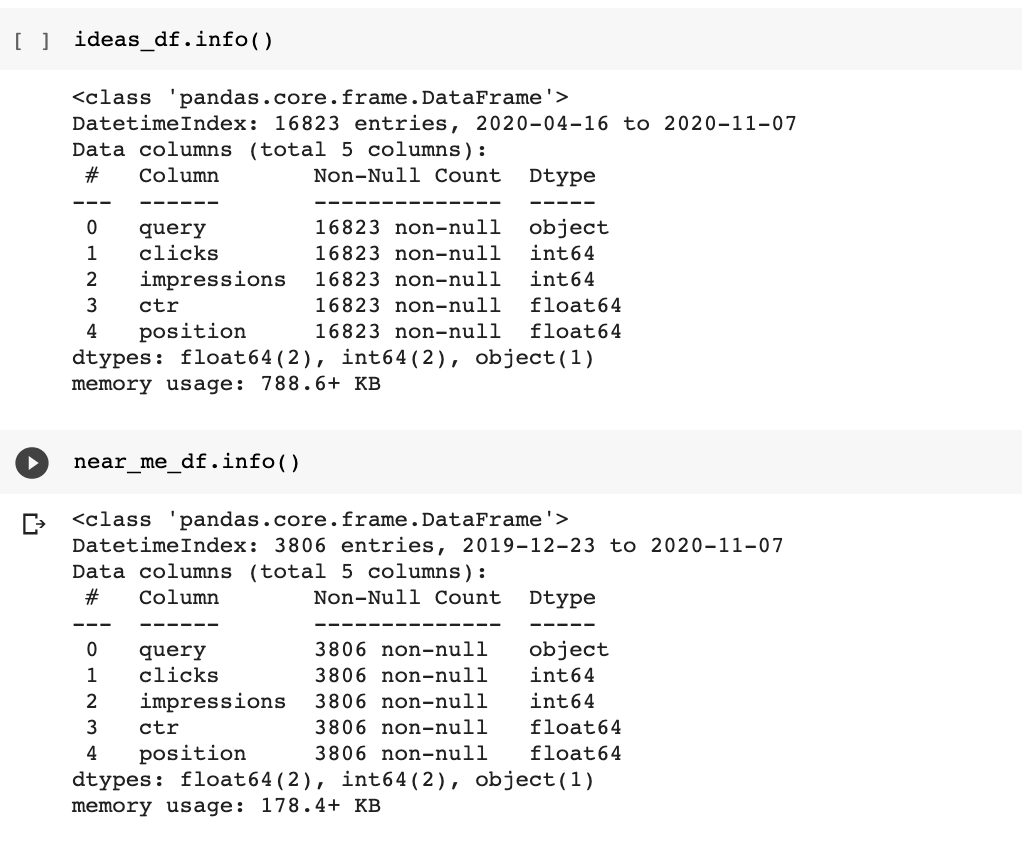
You can see that the date is no longer included in the list of columns.
Let’s group both datasets by month and visualize them.
Here is the code for the “ideas” dataset.
grouped_ideas_df = ideas_df.groupby(pd.Grouper(freq='M')).sum()[["clicks", "impressions"]]
I highlighted in bold letters a powerful pandas class, the Grouper, which enables advanced grouping by dates.
M stands for month end frequency.
We also use D, which stands for calendar day frequency.
You can find the full list time series frequency aliases here.
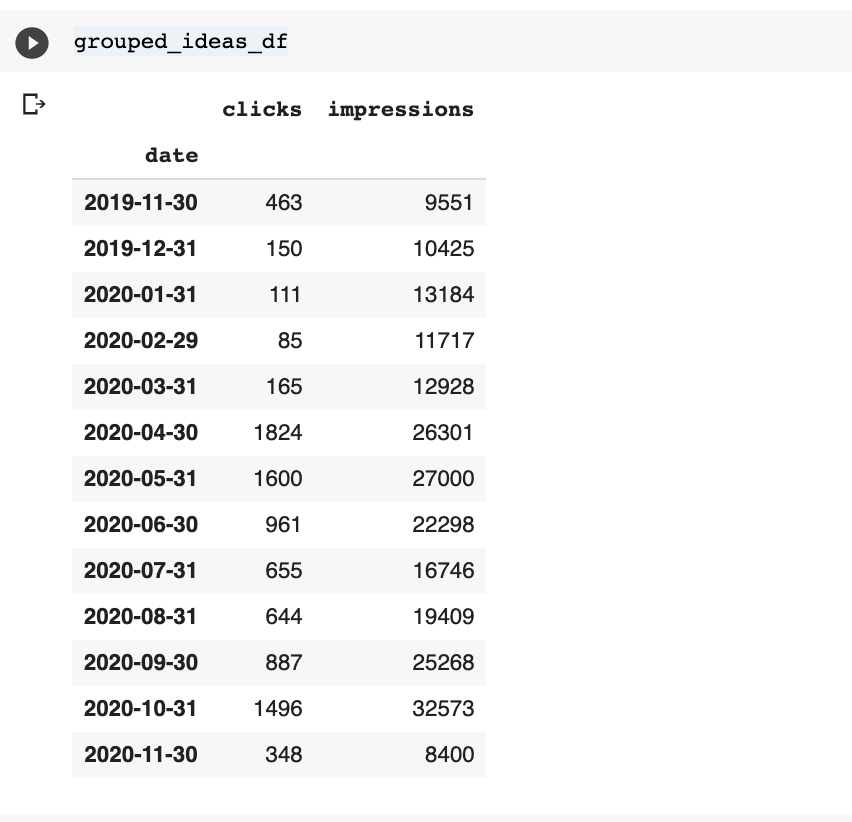
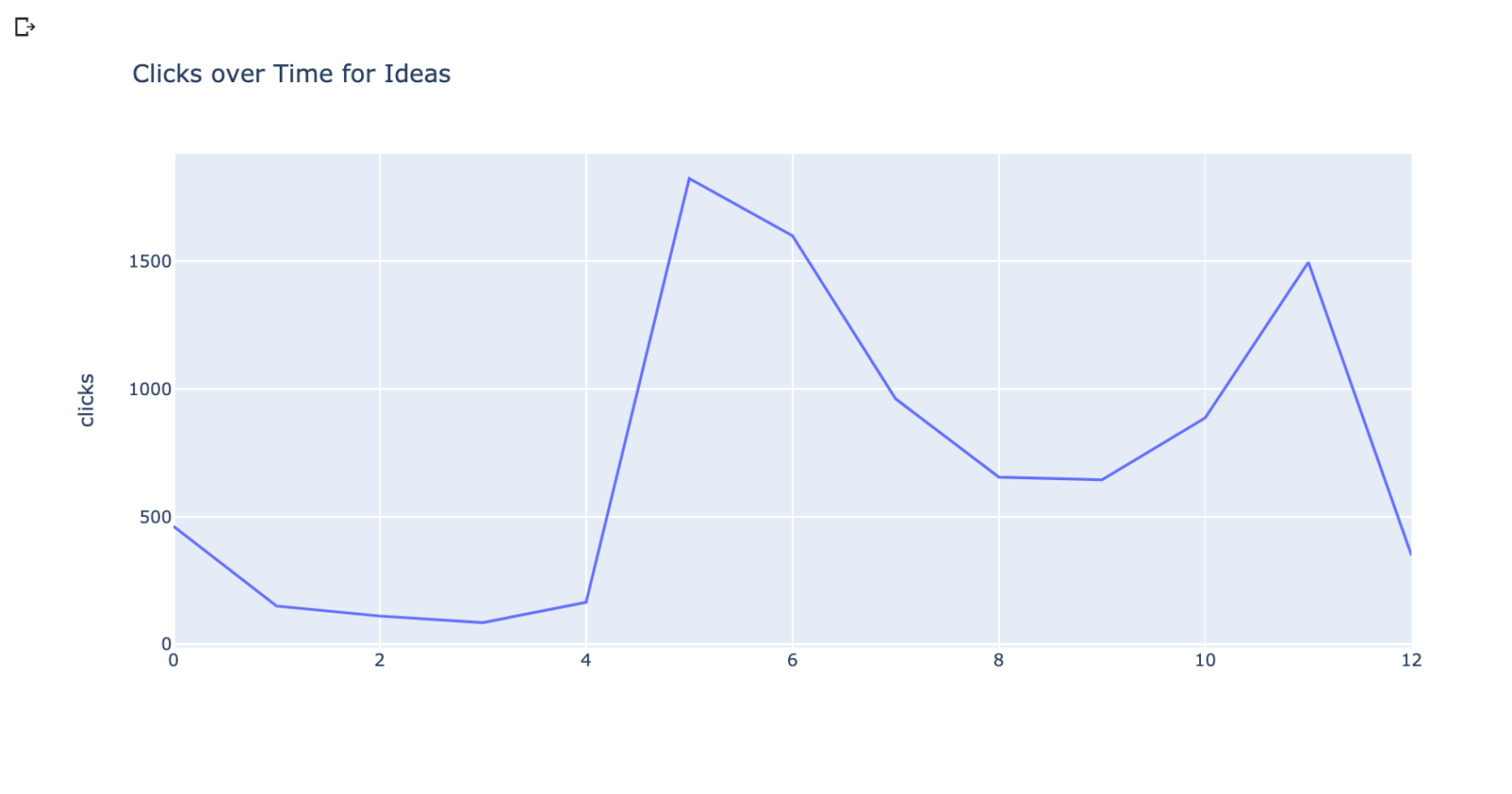
Now, let’s plot the datasets to see their historical performance.
We are going to use the plotting library plotly to do this.
import plotly.express as px
fig = px.line(grouped_ideas_df, y="clicks", title='Clicks over Time for Ideas')
fig.show()
This is the plot for the near me queries.
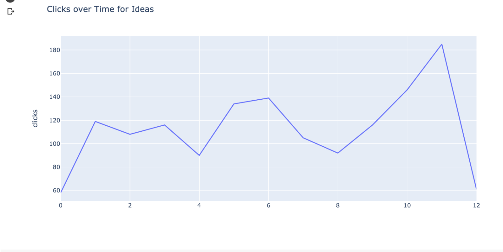
These visualizations clearly show an increased demand for both opportunities, but we can do better and try forecasting to see what the future impact could be.
Monthly data points are too few to build predictive models.
Let’s increase the frequency to days.
Here is what the plots look like with daily data.
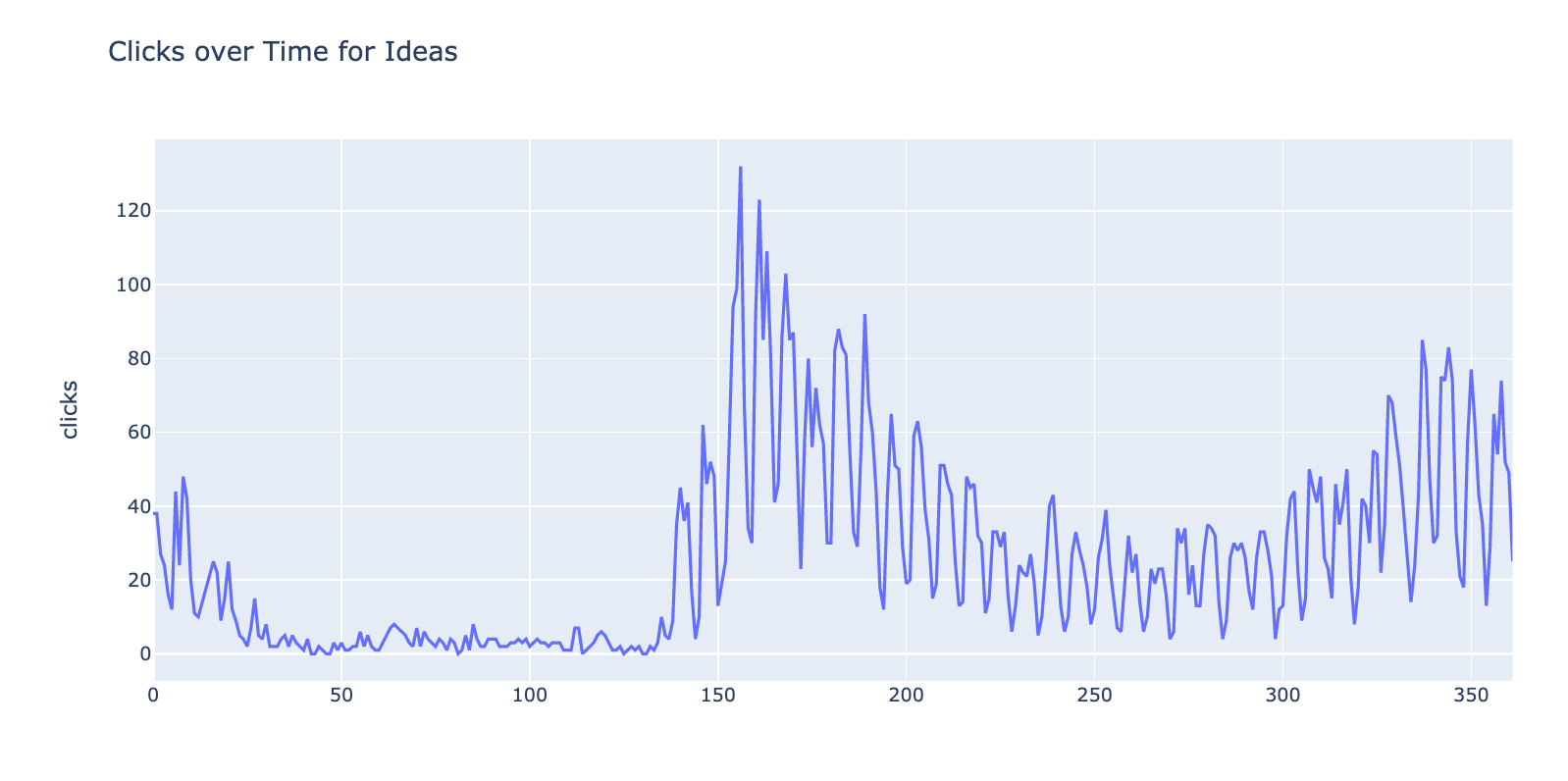
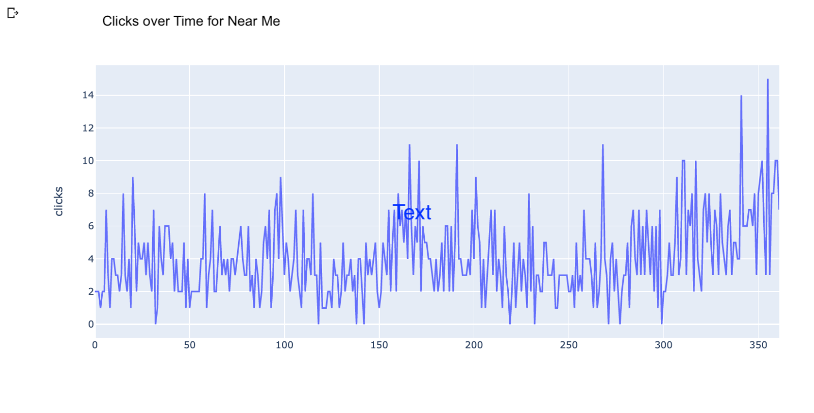
Once we have the datasets grouped by day, we can use the Facebook Prophet library to forecast clicks several days into the future.
We are going to use code from a recent Python Twittorial from my team.
from a recent Python Twittorial from my team.
from a recent Python Twittorial from my team.
We just need to rename the columns to match what is expected by the library.
dft = grouped_ideas_df.reset_index().rename(columns={"date":"ds", "clicks":"y"})
We can train the predictive model with two lines.
m = Prophet()

m.fit(dft)
Once the model is trained, we can predict the next 30 days with this.
#Predicting clicks for the next 30 days.

future_30 = m.make_future_dataframe(periods=30)

forecast_30 = m.predict(future_30)
Finally, we can visualize our forecast for the fundraising ideas dataset.
#Visualizing the prediction for next 30 days.

plot_plotly(m, forecast_30, xlabel='Date', ylabel='Clicks')
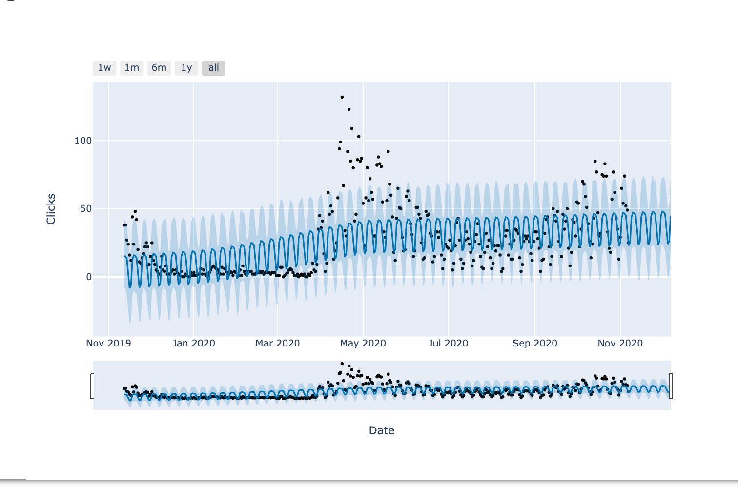
The black dots represent the actual data points.
The dark blue line is the middle point of the predictions and the light blue band is the uncertainty.
You can see the model is trying to fit as many points as it can in the pattern, but it fails to fit the big outlier around May.
This year many things have been unpredictable, so no surprise here.
In practice, the predictions dramatically improve when you have a dataset of at least a couple of years.
The final step is forecasting the traffic of several candidate ideas, sum it up and rank ideas based on the best traffic potential.
This article has been published from the source link without modifications to the text. Only the headline has been changed.


