Dimensionality reduction is an important approach in machine learning. A large number of features available in the dataset may result in overfitting of the learning model. To identify the set of significant features and to reduce the dimension of the dataset, there are three popular dimensionality reduction techniques that are used. In this article, we will discuss the practical implementation of these three dimensionality reduction techniques:-
- Principal Component Analysis (PCA)
- Linear Discriminant Analysis (LDA), and
- Kernel PCA (KPCA)
Dimensionality Reduction Techniques
Principal Component Analysis
Principal Component Analysis (PCA) is the main linear approach for dimensionality reduction. It performs a linear mapping of the data from a higher-dimensional space to a lower-dimensional space in such a manner that the variance of the data in the low-dimensional representation is maximized. For more information, read this article.
Practical Implementation PCA
In this implementation, we have used the wine classification dataset, which is publicly available on Kaggle. Follow the steps below:-
#1. Import the libraries

import numpy as np
import matplotlib.pyplot as plt
import pandas as pd

#2. Import the dataset

dataset = pd.read_csv('Wine.csv')
X = dataset.iloc[:, 0:13].values
y = dataset.iloc[:, 13].values

#3. Split the dataset into the Training set and Test set

from sklearn.model_selection import train_test_split
X_train, X_test, y_train, y_test = train_test_split(X, y, test_size = 0.2, random_state = 0)

#4. Feature Scaling

from sklearn.preprocessing import StandardScaler
sc = StandardScaler()
X_train = sc.fit_transform(X_train)
X_test = sc.transform(X_test)

#5. Apply PCA

from sklearn.decomposition import PCA
pca = PCA(n_components = 2)
X_train = pca.fit_transform(X_train)
X_test = pca.transform(X_test)
explained_variance = pca.explained_variance_ratio_

#6. Fit the Logistic Regression to the Training set

from sklearn.linear_model import LogisticRegression
classifier = LogisticRegression(random_state = 0)
classifier.fit(X_train, y_train)


#7. Predict the Test set results

y_pred = classifier.predict(X_test)


#8. Make the Confusion Matrix

from sklearn.metrics import confusion_matrix
cm = confusion_matrix(y_test, y_pred)
#9. Visualize the Training set results

from matplotlib.colors import ListedColormap
X_set, y_set = X_train, y_train
X1, X2 = np.meshgrid(np.arange(start = X_set[:, 0].min() - 1, stop = X_set[:, 0].max() + 1, step = 0.01),
                     np.arange(start = X_set[:, 1].min() - 1, stop = X_set[:, 1].max() + 1, step = 0.01))
plt.contourf(X1, X2, classifier.predict(np.array([X1.ravel(), X2.ravel()]).T).reshape(X1.shape),
             alpha = 0.75, cmap = ListedColormap(('red', 'green', 'blue')))
plt.xlim(X1.min(), X1.max())
plt.ylim(X2.min(), X2.max())
for i, j in enumerate(np.unique(y_set)):
    plt.scatter(X_set[y_set == j, 0], X_set[y_set == j, 1],
                c = ListedColormap(('red', 'green', 'blue'))(i), label = j)
plt.title('Logistic Regression (Training set)')
plt.xlabel('PC1')
plt.ylabel('PC2')
plt.legend()
plt.show()
#10.Visualize the Test set results

from matplotlib.colors import ListedColormap
X_set, y_set = X_test, y_test
X1, X2 = np.meshgrid(np.arange(start = X_set[:, 0].min() - 1, stop = X_set[:, 0].max() + 1, step = 0.01),
                     np.arange(start = X_set[:, 1].min() - 1, stop = X_set[:, 1].max() + 1, step = 0.01))
plt.contourf(X1, X2, classifier.predict(np.array([X1.ravel(), X2.ravel()]).T).reshape(X1.shape),
             alpha = 0.75, cmap = ListedColormap(('red', 'green', 'blue')))
plt.xlim(X1.min(), X1.max())
plt.ylim(X2.min(), X2.max())
for i, j in enumerate(np.unique(y_set)):
    plt.scatter(X_set[y_set == j, 0], X_set[y_set == j, 1],
                c = ListedColormap(('red', 'green', 'blue'))(i), label = j)
plt.title('Logistic Regression (Test set)')
plt.xlabel('PC1')
plt.ylabel('PC2')
plt.legend()
plt.show()
Linear Discriminant Analysis
Linear Discriminant Analysis (LDA) is used to find a linear combination of features that characterizes or separates two or more classes of objects or events. It explicitly attempts to model the difference between the classes of data. It works when the measurements made on independent variables for each observation are continuous quantities. When dealing with categorical independent variables, the equivalent technique is discriminant correspondence analysis.
Practical Implementation
In this implementation, we have used the wine classification dataset, which is publicly available on Kaggle. Follow the steps below:-
#1. Import the libraries
import numpy as np
import matplotlib.pyplot as plt
import pandas as pd

#2. Import the dataset
dataset = pd.read_csv('Wine.csv')
X = dataset.iloc[:, 0:13].values
y = dataset.iloc[:, 13].values

#3. Split the dataset into Training set and Test set
from sklearn.model_selection import train_test_split
X_train, X_test, y_train, y_test = train_test_split(X, y, test_size = 0.2, random_state = 0)

#4. Feature Scaling
from sklearn.preprocessing import StandardScaler
sc = StandardScaler()
X_train = sc.fit_transform(X_train)
X_test = sc.transform(X_test)

#5. Apply LDA
from sklearn.discriminant_analysis import LinearDiscriminantAnalysis as LDA
lda = LDA(n_components = 2)
X_train = lda.fit_transform(X_train, y_train)
X_test = lda.transform(X_test)

#6. Fit Logistic Regression to the Training set
from sklearn.linear_model import LogisticRegression
classifier = LogisticRegression(random_state = 0)
classifier.fit(X_train, y_train)

#7. Predict the Test set results
y_pred = classifier.predict(X_test)

#8.Make the Confusion Matrix
from sklearn.metrics import confusion_matrix
cm = confusion_matrix(y_test, y_pred)
#9. Visualize the Training set results
from matplotlib.colors import ListedColormap
X_set, y_set = X_train, y_train
X1, X2 = np.meshgrid(np.arange(start = X_set[:, 0].min() - 1, stop = X_set[:, 0].max() + 1, step = 0.01),
                     np.arange(start = X_set[:, 1].min() - 1, stop = X_set[:, 1].max() + 1, step = 0.01))
plt.contourf(X1, X2, classifier.predict(np.array([X1.ravel(), X2.ravel()]).T).reshape(X1.shape),
             alpha = 0.75, cmap = ListedColormap(('red', 'green', 'blue')))
plt.xlim(X1.min(), X1.max())
plt.ylim(X2.min(), X2.max())
for i, j in enumerate(np.unique(y_set)):
    plt.scatter(X_set[y_set == j, 0], X_set[y_set == j, 1],
                c = ListedColormap(('red', 'green', 'blue'))(i), label = j)
plt.title('Logistic Regression (Training set)')
plt.xlabel('LD1')
plt.ylabel('LD2')
plt.legend()
plt.show()
#10. Visualize the Test set results
from matplotlib.colors import ListedColormap
X_set, y_set = X_test, y_test
X1, X2 = np.meshgrid(np.arange(start = X_set[:, 0].min() - 1, stop = X_set[:, 0].max() + 1, step = 0.01),
                     np.arange(start = X_set[:, 1].min() - 1, stop = X_set[:, 1].max() + 1, step = 0.01))
plt.contourf(X1, X2, classifier.predict(np.array([X1.ravel(), X2.ravel()]).T).reshape(X1.shape),
             alpha = 0.75, cmap = ListedColormap(('red', 'green', 'blue')))
plt.xlim(X1.min(), X1.max())
plt.ylim(X2.min(), X2.max())
for i, j in enumerate(np.unique(y_set)):
    plt.scatter(X_set[y_set == j, 0], X_set[y_set == j, 1],
                c = ListedColormap(('red', 'green', 'blue'))(i), label = j)
plt.title('Logistic Regression (Test set)')
plt.xlabel('LD1')
plt.ylabel('LD2')
plt.legend()
plt.show()
Kernel Principal Component Analysis
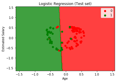
Kernel Principal Component Analysis (KPCA) is an extension of PCA that is applied in non-linear applications by means of the kernel trick. It is capable of constructing nonlinear mappings that maximize the variance in the data.
Practical Implementation
In this practical implementation kernel PCA, we have used the Social Network Ads dataset, which is publicly available on Kaggle. Follow the steps below:-


