User experience (UX) is everything today. Poor digital experience can easily and quickly reflect in your client list and thus, your bottom line. It starts from the first user interaction with your website or webapp and ends with… well, it never quite ends. User experience is, in fact, a continuous process that goes on and on until the user decides to stop using your product. That’s probably why the number of potential UX metrics is ever-growing and now there’s a lot that you can track.
To successfully measure user experience you need to monitor both usability and business KPIs, from real user to engagement, usability, adoption, as well as retention. Still, while looking at the bigger picture, the key is to select the right metrics to keep tabs on and optimize to improve user interactions and overall satisfaction with your website or webapp. With the help of UX performance indicators, you can quantify and calculate the ROI of the changes you’ve brought to your product in terms of experience, which is otherwise impossible.
In this post, we are going to explore what are the most important UX metrics you should monitor to ensure flawless user experience.
How Are UX Metrics Defined?
There’s no universal recipe for what metrics are best. It all depends on the industry you are in and your business goals. You need to choose the ones that will help you measure your progress and that impact the decisions the most.
UX metrics measure a product’s user experience. Unlike other types of metrics such as sales, finance, or marketing, they are difficult to quantify since they reflect human behavior and attitude. Big brands such as Google, Airbnb, or YouTube use UX metrics to improve the user experience of their products to keep their customers happy.
This data is hard to translate into numbers, but there are some useful frameworks that made it possible such as Forrester’s Customer Experience which groups these metrics into three main categories:
- Descriptive metrics that provide information on what happened and include usability and real user monitoring metrics.
- Perception metrics that show how customers perceived what happened and are illustrated by engagement metrics.
- Outcome metrics that describe what customers did or expected to do based on their perceptions. This category includes adoption and retention performance metrics.
Here is an example breakdown of the most important UX metrics to track, impacting each category:
1. Real User Monitoring Metrics
Real User Monitoring (RUM for short or end-user experience monitoring), which you can read all about in our RUM guide, is a technology that allows you to monitor and analyze your customers’ experience throughout your website or application and see exactly how they interact with it. It enables you to see everything from HTTP requests, crashes, timeouts to Apdex scores that speak to your users’ satisfaction with your product or service.
There are many benefits to using a RUM solution as every little deviation from optimal performance across locations or devices can have major consequences to your bottom line. Not only that, but by implementing RUM in your business will help your developers have an early warning system that will tell them when things start to go sideways by setting alerts for things like Apdex metrics, page load times, timeouts, and errors, etc.
You’ll have actionable insights about what’s affecting your users’ experience with your product and have the option to fix the issue before you have a catastrophic failure.
There are several important RUM metrics you need to consider for your webapp in order to ensure optimal performance for all your users:
Apdex and User Satisfaction Score
User Satisfaction Score or Apdex is a measurement of your users’ level of satisfaction based on the response time of request(s) when interacting with your website or application.
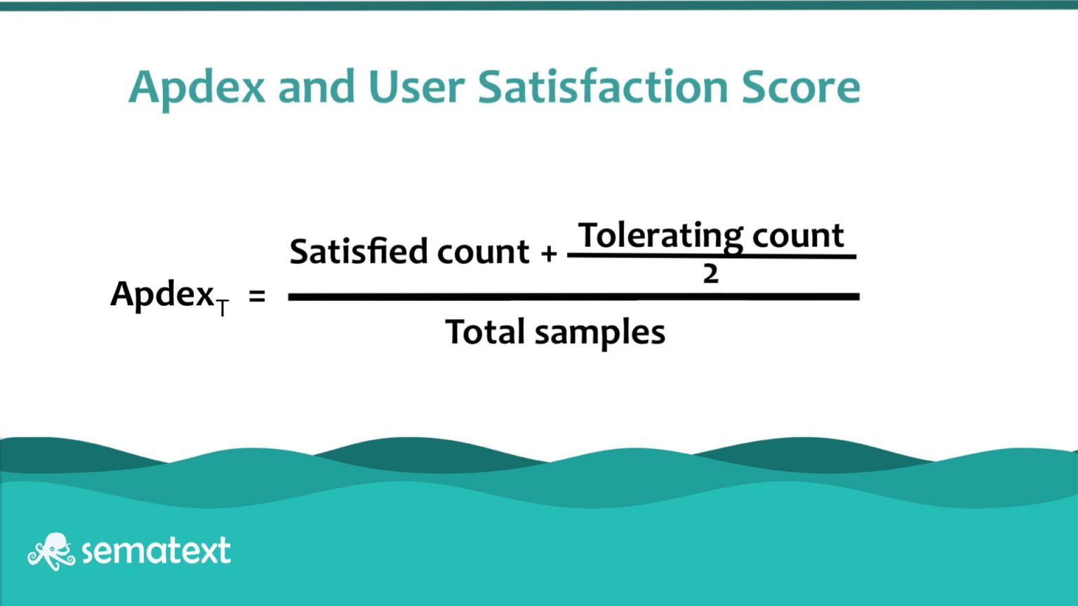
The way you calculate it is quite simple based on the Satisfied count which is the number of requests, the tolerating count which is the number of requests, and the Total samples is basically all your requests.
HTTP Requests
Load times are extremely important to monitor as they directly impact how your users perceive your service and that will influence their decision whether or not to become customers.
Based on the number of your separate requests and their response time, the load time for your webapp can be influenced dramatically.
Sematext as a RUM solution
Sematext Experience, our RUM solution, will give you insights into your load times by breaking them down into small components, providing a birds-eye view of what influences your app speed.
A simple screen will tell you exactly where your system is underperforming and where is the most room for improvement.
Apdex is also a big part of Sematext, it’s how we tell if the website is raising to customer expectations. You’ll be able to set up simple alerts that will notify when your users’ satisfaction is below a certain threshold so that you can take the necessary steps to correct the issue.
Learn how Sematext compares to other tools from our blog post where we covered the best RUM solutions available today.
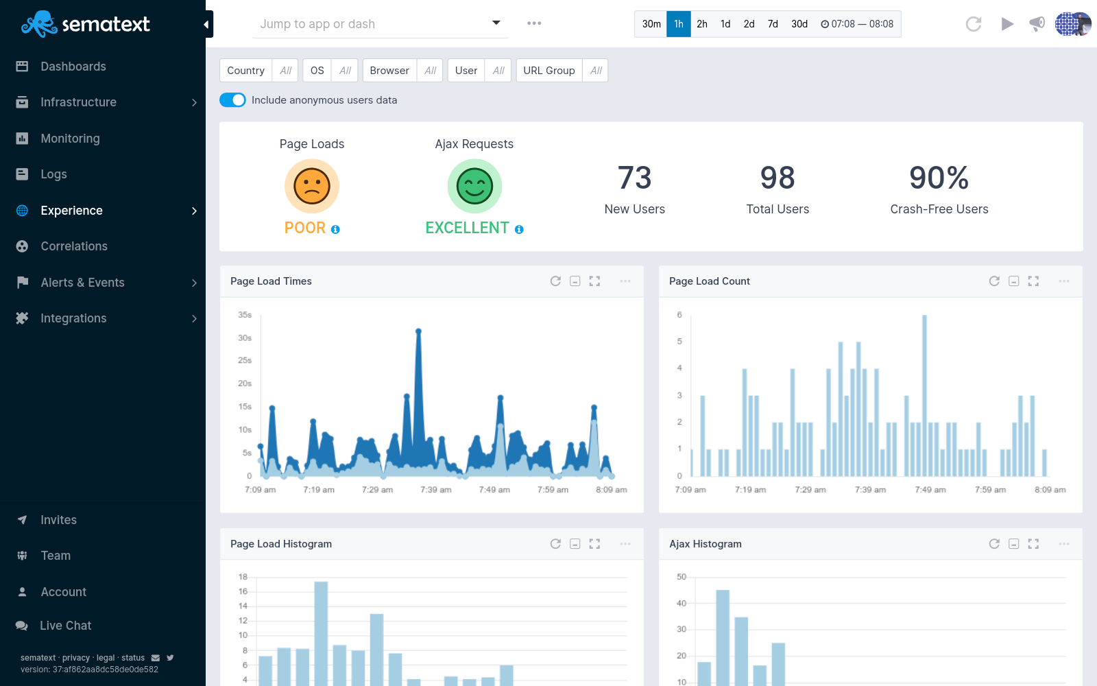
Understanding how your service caters to your worldwide audience is going to be a crucial aspect of your business. Within the Geography tab, you’ll be able to tell exactly which regions your users are having a difficult time loading the app or what type of device/connection isn’t working as expected.
2. User Engagement Metrics
Different user experience engagement metrics give you great insight into how hooked users are with your website, from the frequency of usage to depth and volume of usage. They show what users are or aren’t interested in so that you can make quick changes and avoid mistakes that could drive them away. Check out some of the most important engagement metrics you should keep track of to improve user experience.
Unique Visitors
Unique visitor is a term used to describe a person that visits a website at least once during the reporting period. The unique visitors metric is the number of distinct visitors visiting a page or multiple pages on your website in a given time.
New vs Returning Visitors
New visitors are users who are navigating to your website for the first time on a specific device.
Returning visitors are those who have previously visited your website. Google considers returning visitors as those who have returned from the same device within a two-year time frame. If a user visits a website after more than two years, then it’s counted as a new visitor. A low number of returning visitors can be a sign of poor user experience or that your product fails to deliver to its promises.
This metric is presented as a pie graph, comparing the ratio between the two. You should always have an influx of new traffic – 50-70% is a good range, but as usual, it depends on the industry you are in and what are your website goals. A higher level of new visitors equals higher revenue – as long as your returning customers are returning.
Pageviews
When it comes to measuring website traffic, you want to look at pageviews.
Pageview is the engagement metric measuring how many times users have accessed a particular page on your website within a given time frame. A higher number of pageviews could be a sign of interest, but it can also indicate that people are surfing your website without finding what they’re looking for. That’s why you need to look for context and correlate pageviews with other engagement metrics that we’ll discuss below.
Time on Page
There are two ways to look at time spent, both just as important: time spent on page and session length.
Time spent on page measures the time a user spends on a page on your website. It indicates interest, the more time users spend on the page, the more engaged they are and the better they like your content.
Session length is the amount of time a user spends on your website from the moment they land on a page until they exit, or in between the first interaction the last on that they perform. Longer sessions indicate higher engagement. However, shorter session duration is not necessarily a bad sign. Ir could actually be a good thing, indicating that users have found what they were looking for. As mentioned earlier, it’s important to look at the bigger picture and see what other engagement performance metrics tell you.
Pages per Session
Pages per session is the average number of pages viewed during a session on your website. More pages visited means that users are exploring more of your site and are more engaged. Knowing what users are doing on your website and what pages they are looking at makes it easier for you to detect user experience issues and see how certain parts of your website or webapp are performing.
Conversion Rate
Customer engagement is key for driving conversions and overall profitability. So if your website or app feature desired actions you want users to take, such as signing up, filling up a form, making a transaction, etc., you’ll want to measure how many users are completing these steps or are getting converted.
Thus, the conversion rate is the percentage of users that follow a set of directions you want them to perform. This metric also allows you to see where users are dropping off in various stages of their experience navigating your website.
3. Usability Metrics
Usability metrics reflect users’ behaviors, telling you what they actually do on your website, as well as how easy it was for them to accomplish what they were set to do. This is the most common category of success metrics that UX teams are already tracking. Let’s see which are the main usability metrics you should use to monitor user experience:
Task Success Rate
Task success rate, or task completion rate, is the percentage of users who have successfully executed a task. You can only measure the success rate if you are very specific as to what the end goal is, whether it’s to fill out a form, buy a product, etc.
Although it says nothing about why users fail, task success rate is a good indicator to start measuring user experience.
Naturally, users may have some difficulties when first using your product. It’s best that you measure success rate on going as they gain more experience. It will give you an idea about your product’s learning curve, which is a great indicator of user experience success. You want the success rate to be as high as possible.
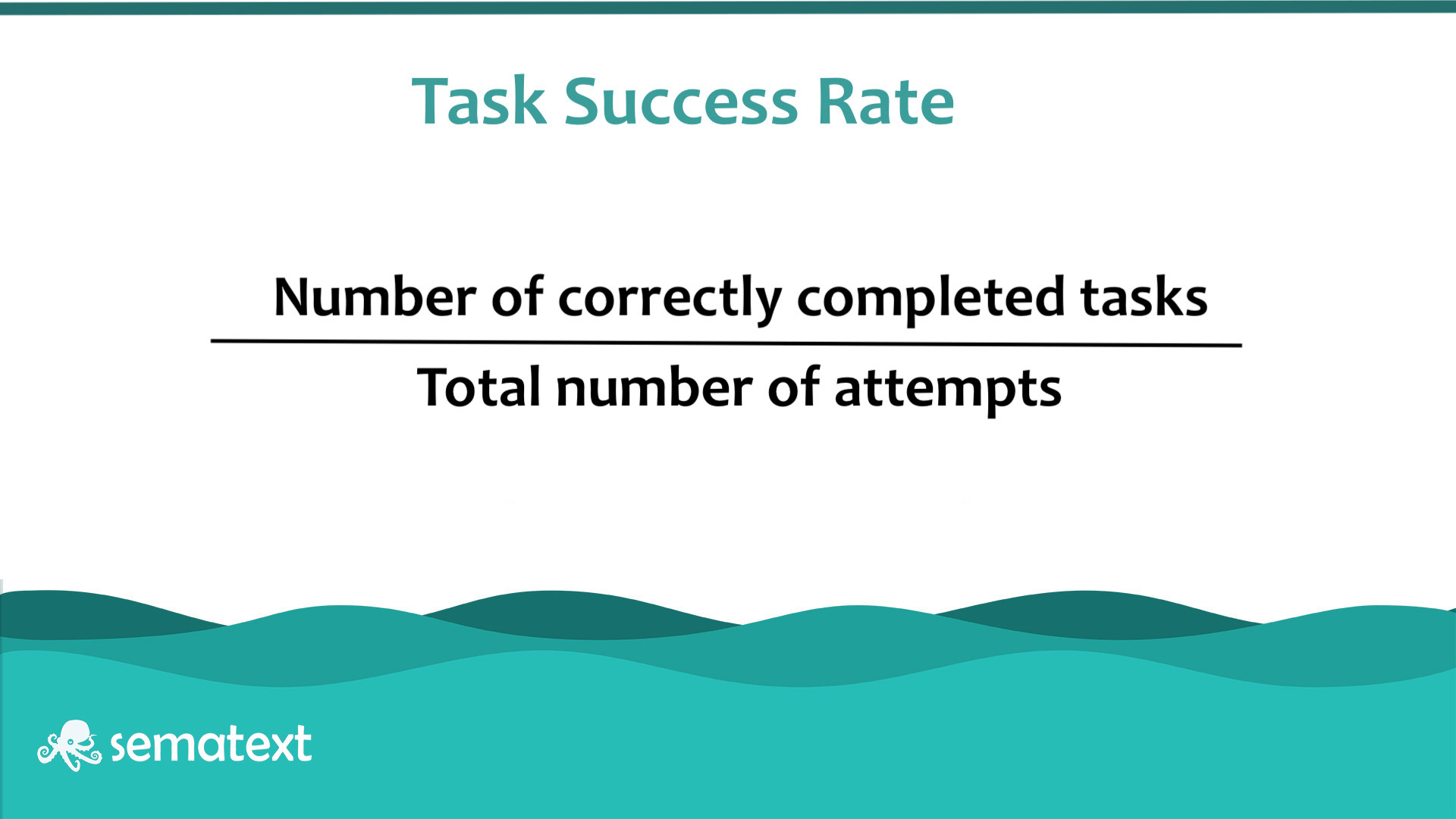
You can calculate task success rate by dividing the number of correctly completed tasks by the total number of attempts.
Time-on-Task
Time on task, or task time, or task completion time, is the average time a user needs to complete a task successfully. It’s a useful metric as it tells you how certain actions affect user productivity, which usually plays a big role in how satisfied customers are. Needless to say, the shorter the time, the better the user experience.
Use of Search vs. Navigation
This metric helps you understand how efficient your architecture and navigation are. The navigation bar is one of the most important elements of a website or webapp and should be intuitive enough so that people can easily and quickly reach their destination. If that’s not possible and they get lost, they turn to the search bar. In most cases, the less the search function is used, the better.
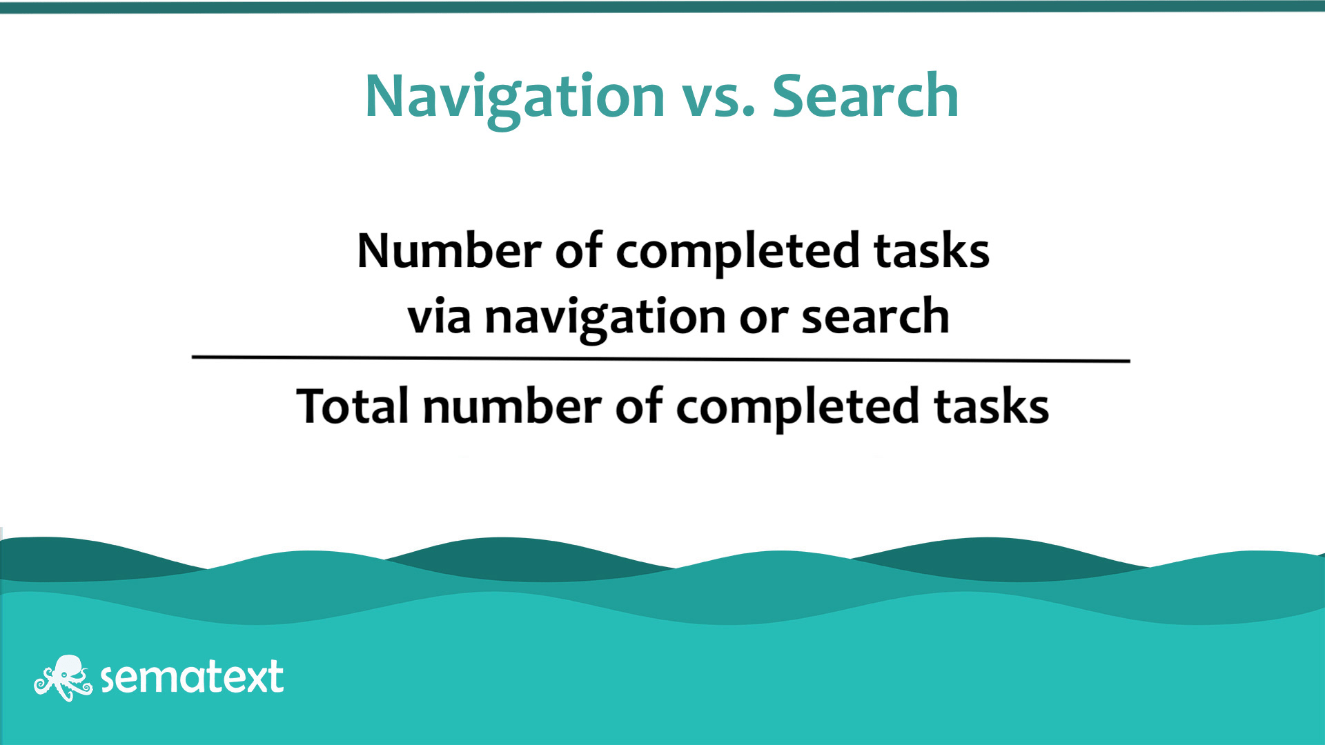
You can calculate the Navigation vs. Search ratio by dividing the number of tasks accomplished via navigator or search by the number of completed tasks.
User Error Rate
The user error rate is the number of users who made a mistake while doing a task, such as navigating to the wrong part of a website or an unsuccessful attempt to enter the email address in the contact form. It’s a good indicator of user performance as well as for how user-friendly your website or webapp really is. Errors are closely related to usability issues. In fact, usability is the source of errors, so a high error rate means that you have serious usability problems. However, you need to be very specific as what actions are perceived as errors,
There are two ways to calculate the error rate, depending on the number of error opportunities a task allows and what you need to measure. For example, filling in a form has many opportunities for failure.
If your task has only one potential error or there are many error opportunities but you want to track only one of them – for example when entering the email address in the “Repeat email address” field – you want to measure the error occurrence rate by dividing the total number of errors that occurred for all users by the number of error opportunities for all users.

If there are multiple error opportunities per task or you want to measure multiple errors, you can calculate the error rate by dividing the number of errors by the total number of attempts.

System Usability Scale (SUS)
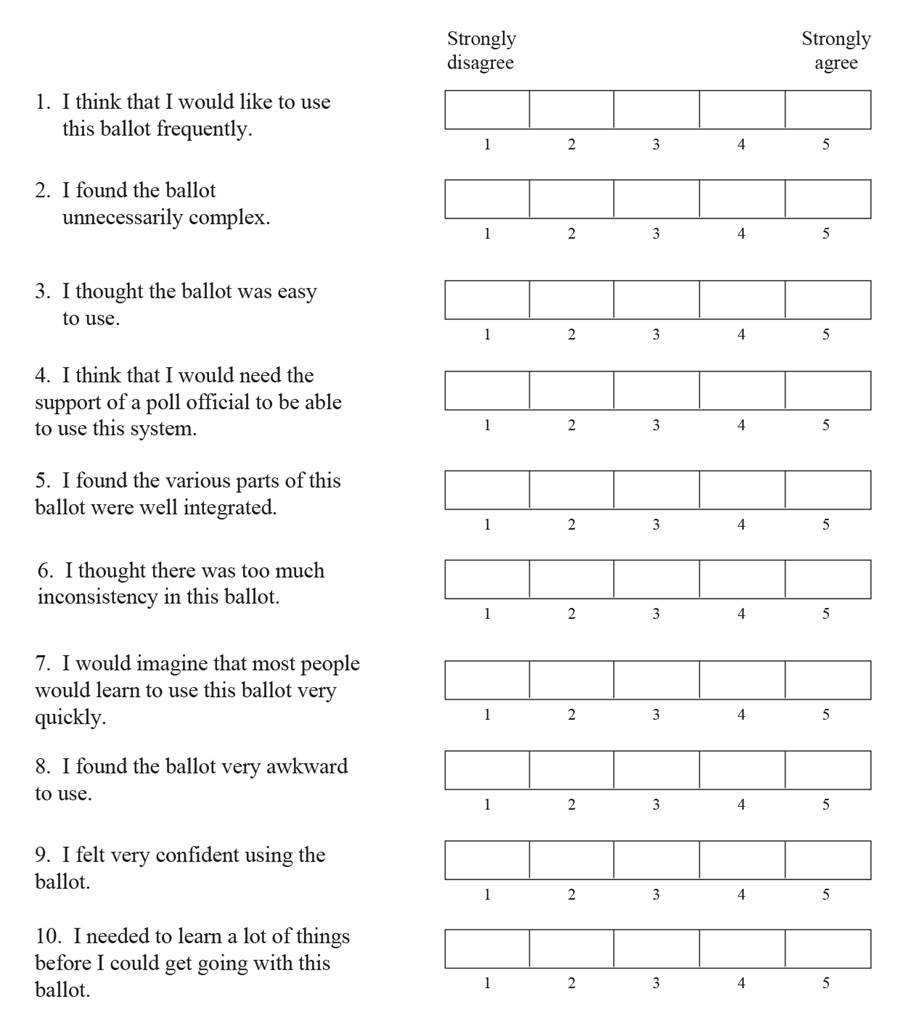
The System Usability Scale (SUS) is one of the most popular tools used to assess the usability of a product. It’s a questionnaire consisting of 10 statements that users need to rate on a five-point scale from strongly agree to strongly disagree. SUS is a way to quantify qualitative data, like a user’s perceived satisfaction of a product or service following a usability testing or after they have used the product.
At the same time, you can use it as a benchmarking tool against the product before improvement or in comparison to competitors. Based on the answers, you get a score between 1 and 100. The higher the score, the better the usability.
4. User Adoption Metrics
By measuring adoption metrics, you can see how often customers are using your product, which features they are using and what they are doing with those features. In a nutshell, you are trying to see if users are experiencing value from their investment. This is critical information for successful customer management and for product managers as it helps them understand how to evolve the offerings. Needless to say, a higher adoption rate means that more individuals are adopting the product than abandoning it.
Here are the most important adoption metrics that measure customer product engagement:
Active Users
The number of active users is the most basic – and straightforward – of adoption metrics. For a better understanding of your product or service usage, you should go further and measure Daily Active Users (DAU), Weekly Active Users (WAU), Monthly Active Users (MAU), and stickiness (DAU/MAU).
As a rule, the number of active users should be higher than the number of new users, indicating that you have returning users. However, first you need to define what “active users” mean as in how many times do users need to interact with the product within a certain time frame.
Stickiness is another key metric. Combined with the feature adoption rate (see below), you can easily identify which features make your product addictive, which drive the most engagement.
Product Access
The most immediate way to see if your product or service is bringing value to customers is if they incorporate it into their everyday lives or, in other words, how often do they access said product.
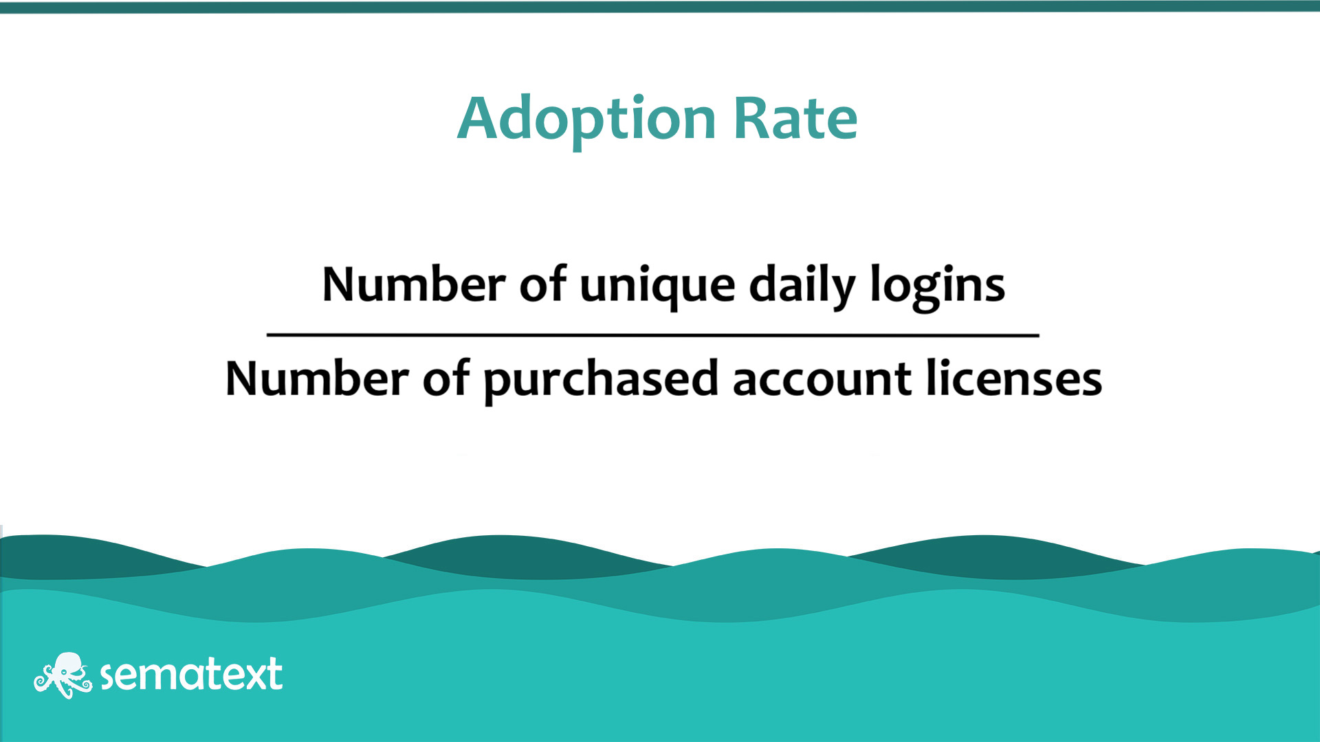
You can track product usage through license utilization. By measuring the number of daily product logins against the number of licenses purchased by a customer you can determine how often they are using your product on a regular basis. This helps your customer success team identify active and at-risk customers so that it can quickly intervene with personalized and more rewarding experiences.
Average Time Spent with Product
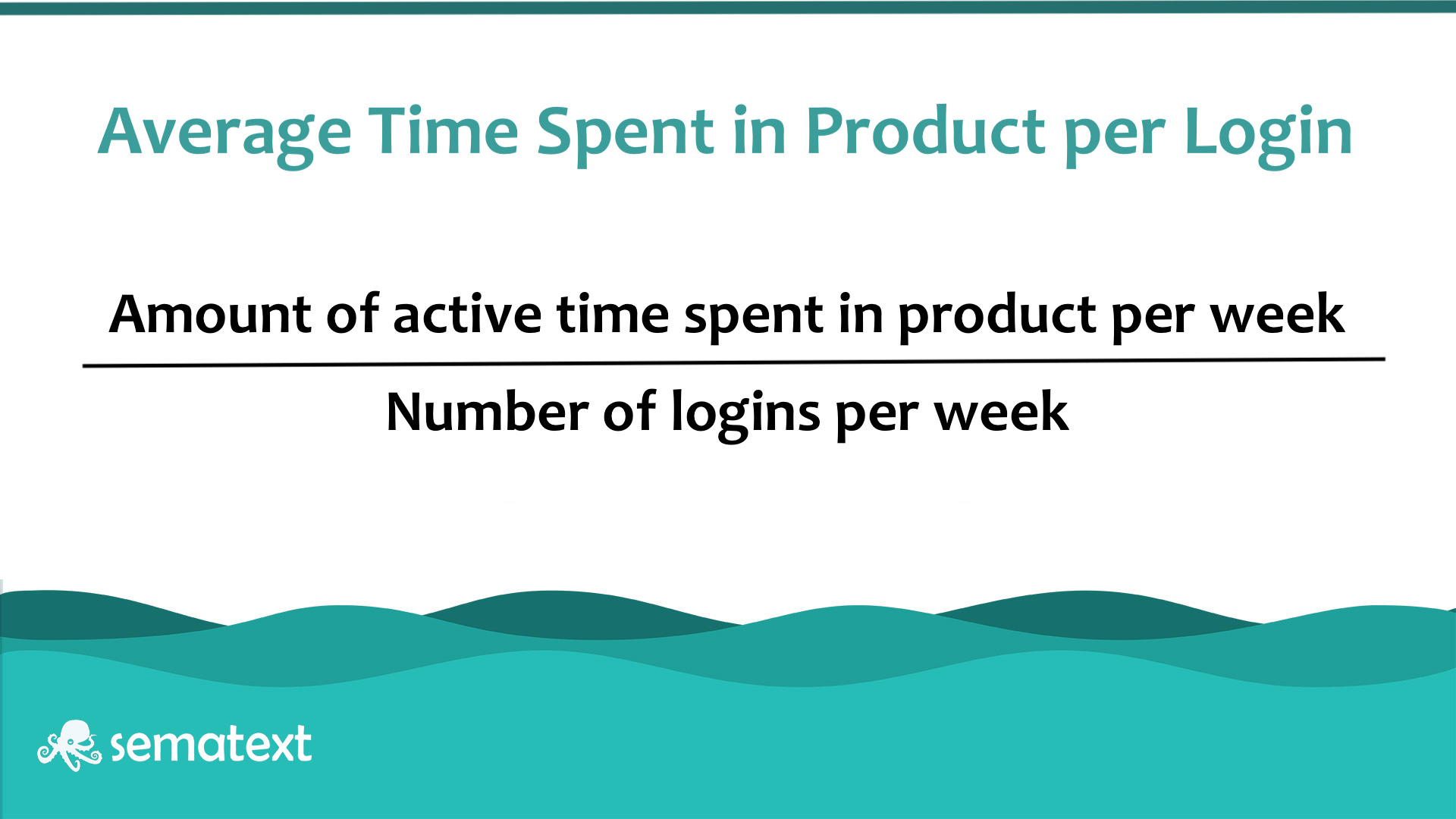
Another way to measure adoption is the average time spent with the product. You can calculate this metric by dividing the amount of time spent in the product by the number of logins within a specific time period.
Feature Adoption Rate
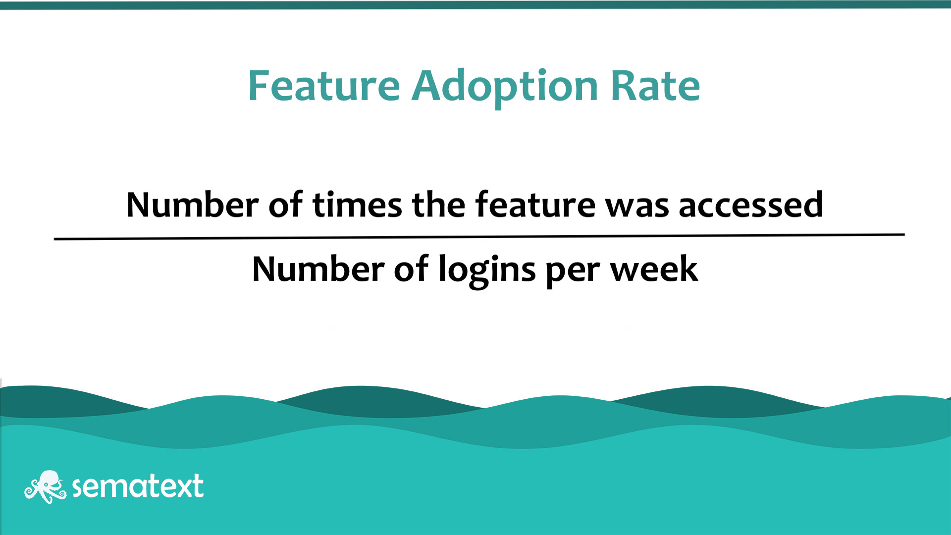
Besides tracking overall product usage, you can zoom in and focus on the time spent using specific features to identify how helpful said feature is for a certain customer or for your entire client database. You can calculate the feature adoption rate by dividing the number of times a feature was used by the number of logins.
5. User Retention Metrics
Retention refers to how many customers keep using your app, product, or service. Thus, retention metrics reveal how well you are meeting user needs and whether you are providing a good customer experience.
Check out which are the key customer retention metrics you should keep track of.
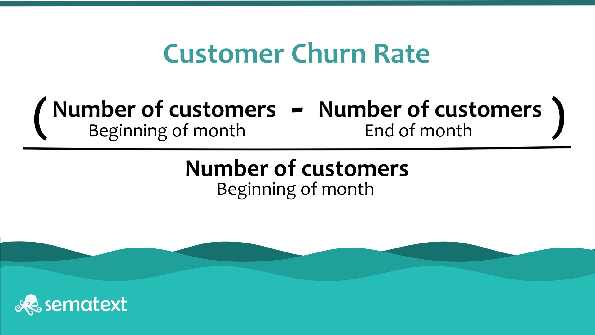
Customer Churn
Customer churn rate is the percentage of customers that have stopped using your product or service over a given period. There is no universally accepted “good” churn rate. It depends on the industry your business is in. If you’re a SaaS and servicing B2B customers, you’ll likely experience lower churn rates. But if you’re offering consumer services such as entertainment services, your churn rate can be significantly higher especially if your offering is not seen as essential.
One thing is for sure: regardless of your industry or market, you want your churn rate to be as low as possible. Otherwise, a high churn rate indicates that your product or service fails to meet customers’ expectations or goals, whether it’s in terms of features, user experience, or something else.
Net Promoter Score
Net Promoter Score (NPS) is a qualitative retention metric that measures general satisfaction and loyalty to your product or service. It tells you if your current customers are happy and how willing they are to promote you to their network. A high NPS guarantees visibility in front of potential customers, while a poor score is an opportunity to tackle satisfaction problems and improve customer satisfaction before it’s too late.
You measure NPS by asking your customers a simple question: from a scale of zero to ten, how likely are you to recommend our product or service to a friend or colleague, with zero being ‘not likely at all’ and ten being ‘extremely likely’?
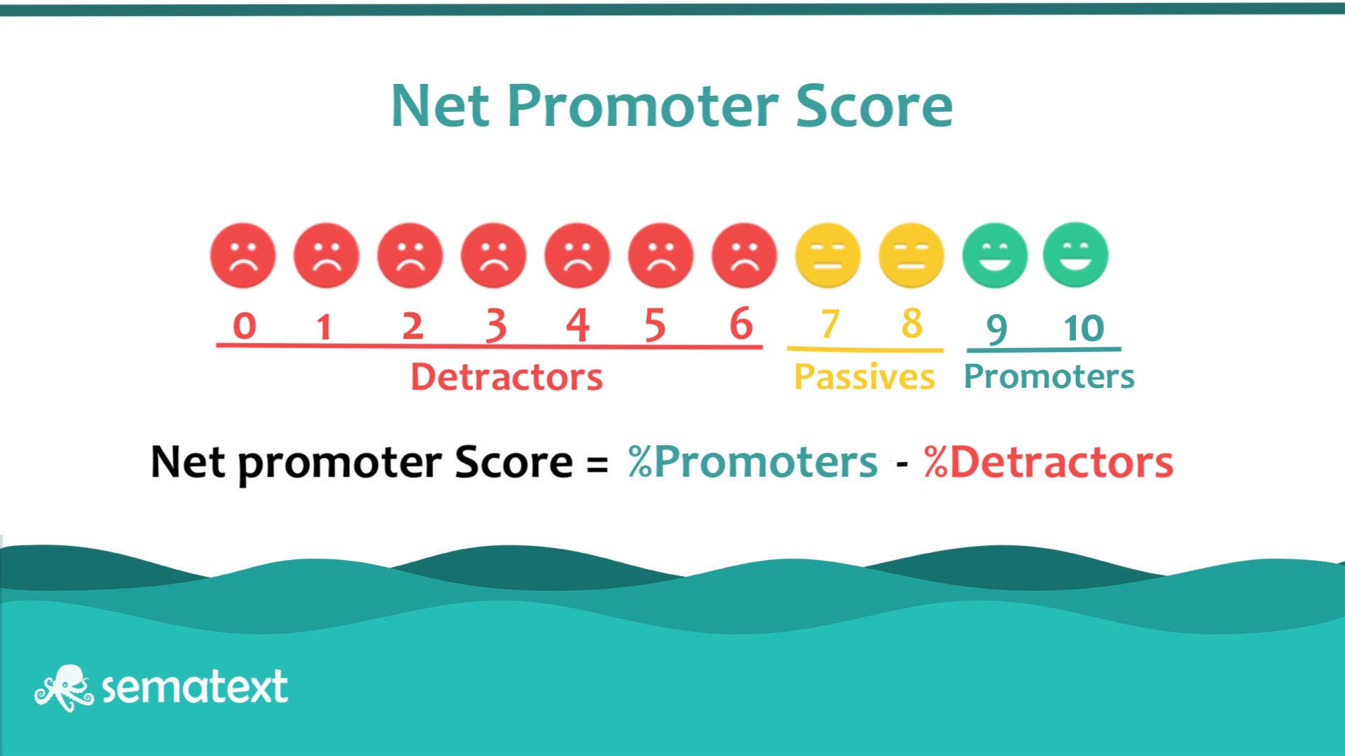
Users giving a rating of 6 or below are called detractors, while the 9’s and 10’s promoters. Then, you calculate NPS subtracting the percentage of detractor responses from the percentage of promoter responses.
Customer Retention Rate
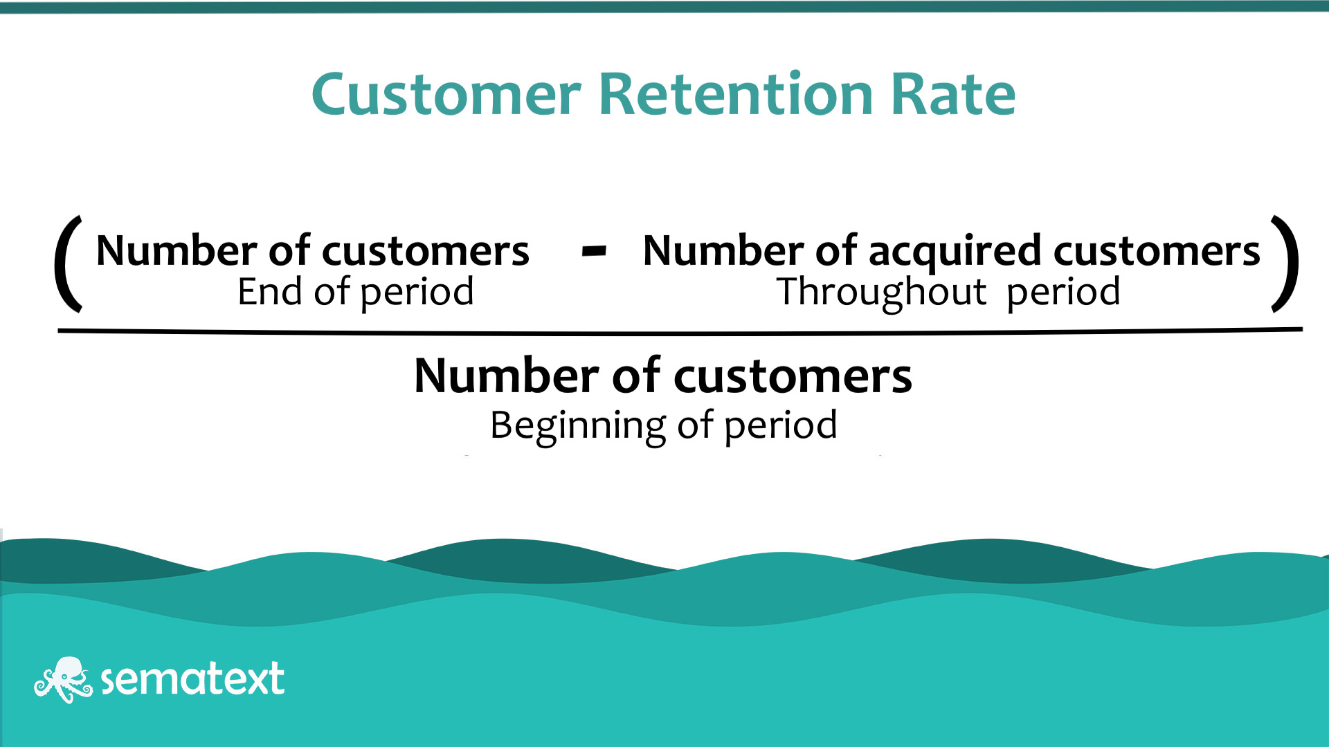
Customer retention rate is the percentage of customers that have stayed with you over a given period of time. This is perhaps the most important straightforward retention metric showing whether your retention strategy is working or rather if users are satisfied enough by your product to come back. Of course, the higher the retention rate, the better.
To calculate the customer retention rate, you subtract the number of acquired customers throughout a period from the number of customers at the end of the period, then divide it by the number of customers at the beginning of the period.
Average Order Value
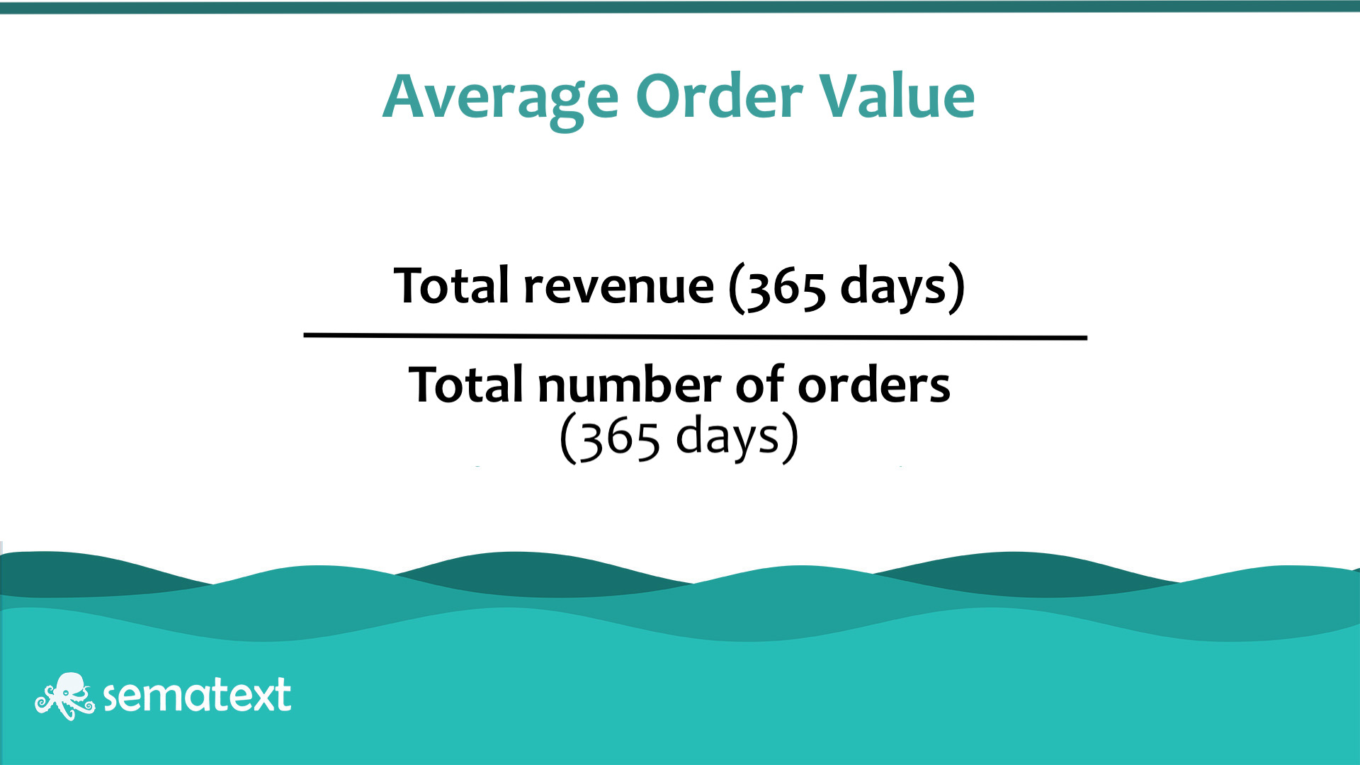
Average order value (AOV) is the average amount of money a customer spends per purchase. If you provide a good UX, the average order value can increase, with more services or products being shopped for together.
To calculate AOV, you divide the total revenue by the number of purchases.
Customer Lifetime Value
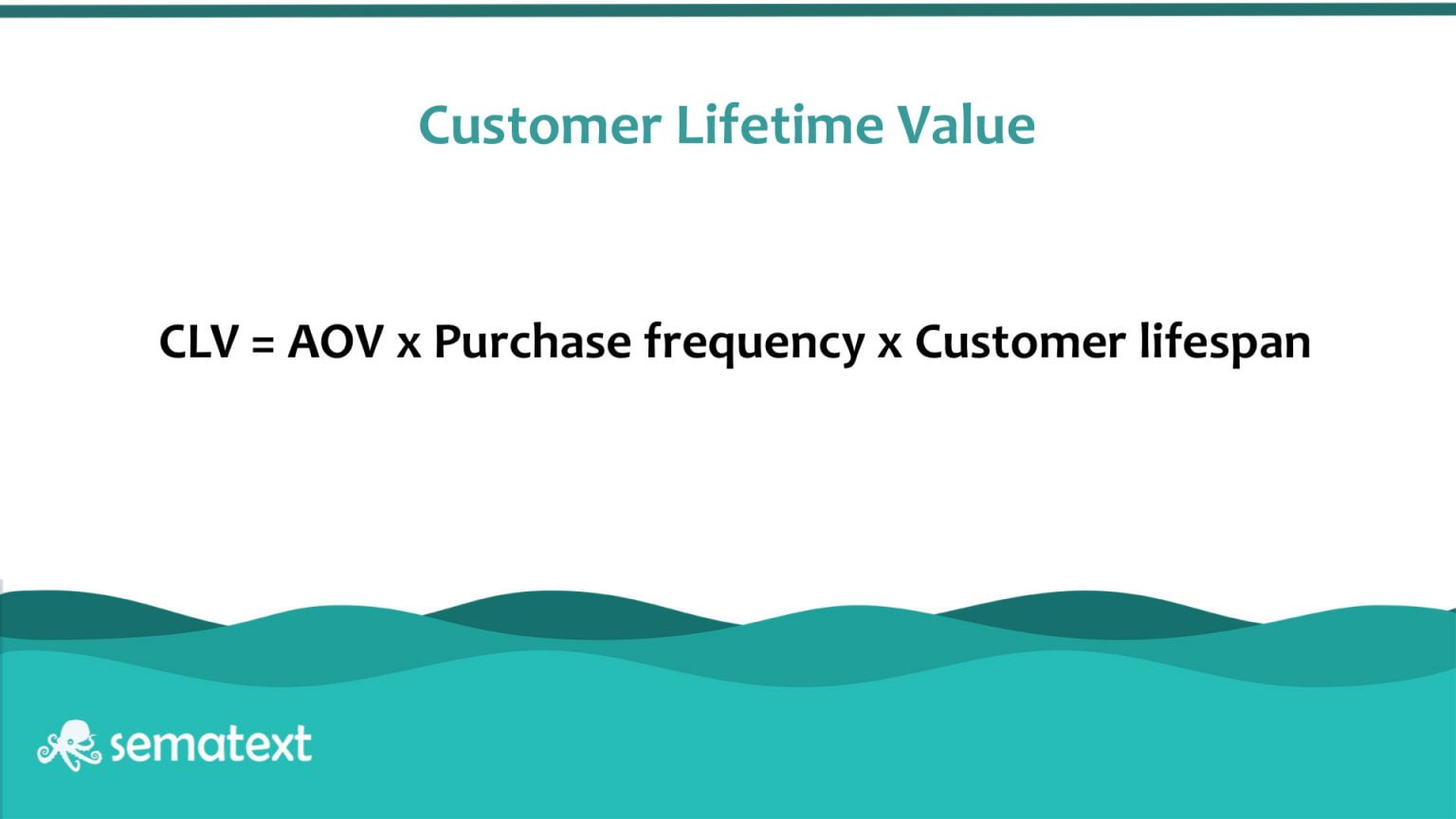
Customer lifetime value (CLV) is a revenue metric that projects how much revenue the average customer will bring you over the course of their relationship with your product or service. You want your CLV to increase or at least stay constant.
This metric is important because it enables you to understand not only how much revenue your product returns, but it also offers valuable insight into user engagement and user retention.
CLV is a bit harder to measure than other metrics as it involves multiple steps. First, you need to determine the average order value you can expect from a customer over the course of a year by dividing the annual gross revenue by the number of purchases.
Step two is to calculate how many times a customer will purchase from you within a year by dividing the number of orders by the number of customers. You then estimate how long you expect a customer to stay with you in terms of years.
The final step is to multiply the average order value by the number of purchases.
Why You Should Measure UX Metrics
There are many reasons why you should rate your website or webapp user experience metrics. We’ve identified some of them:
Alerting
UX metrics act as an early warning system that something is off with your product or service. When combined, you have tons of accurate and valuable information at your disposal that makes it easy for you to spot the weakest points so that you can quickly intervene, as well as your strongest so that you can leverage them.
RUM tools, such as our Sematext Experience can help stay ahead of problems. You can define threshold time for website performance metrics such as page load times, HTTP requests, individual on-page transactions, etc. and be notified in real-time whenever these move past their limits.
Context
UX metrics provide context for the numbers from analytics. They allow you to track and map customer journeys and make correlations between user interactions, thus filling in the how, why, when, and where things went wrong.
Final Thoughts
User experience is more than how user-friendly is your website. It looks at what people see and experience with your product, how they perceive and engage with it, and finally, what they do, and how that reflects in your ROI.
It may prove difficult to measure and the metrics will vary from business to business. However, you should be looking at metrics coming from each step of the framework (descriptive, perception, and outcome).
It all starts with real user metrics – a solution like Sematext Experience can help detect early on when users experience issues due to poor website performance. If their first interaction with you leaves much to desire, most likely they’ll bounce and all your previous marketing efforts would be in vain. Make sure you look at the bigger picture and include all types of UX metrics in your UX strategy, choosing the right ones for your business. Make sure you understand and correlate them to determine the context, and then optimize accordingly. This list should be a nice starting point.
However, we recommend you don’t stop there. Website performance is a complex topic that can be a pain without the proper monitoring tools. Dive even deeper and correlate your UX metrics with other critical site performance metrics to get the full picture of factors that can negatively impact customer experience and, ultimately, your business.
This article has been published from a wire agency feed without modifications to the text. Only the headline has been changed.


