The Problem
The problem is not only hackers, going into accounts, and sending false information. The bigger problem here is what we call “Fake News”. A fake are those news stories that are false: the story itself is fabricated, with no verifiable facts, sources, or quotes.
When someone (or something like a bot) impersonates someone or a reliable source to false spread information, that can also be considered as fake news. In most cases, the people creating this false information have an agenda, that can be political, economical or to change the behavior or thought about a topic.
There are countless sources of fake news nowadays, mostly coming from programmed bots, that can’t get tired (they’re machines hehe) and continue to spread false information 24/7.
The tweets in the introduction are just basic examples of this problem, but much more serious studies in the past 5 years, have demonstrated big correlations between the spread of false information and elections, the popular opinion or feelings about different topics.
The problem is real and hard to solve because the bots are getting better are tricking us. Is not simple to detect when the information is true or not all the time, so we need better systems that help us understand the patterns of fake news to improve our social media, communication and to prevent confusion in the world.
Purpose
In this short article, I’ll explain several ways to detect fake news using collected data from different articles. But the same techniques can be applied to different scenarios.
I will do it in two ways:
- For the coders and experts, I’ll explain the Python code to load, clean, and analyze data. Then we will do some machine learning models to perform a classification task (fake or not)
- For the non-technical people, I’ll use the point-and-click mode in a system called TreasureHunt LEAPS by Analyttica that will allow us to do almost everything we did with Python, but without programming, and automatically see the code produced as well. Note: The links you are clicking for LEAPS are leading you to the site as my affiliate from my recommendation, it’s a free platform but you can win points if you share your links too!
Solving the problem with Python
Data reading and concatenation:
First, we load the data into Python:
fake = pd.read_csv("data/Fake.csv")
true = pd.read_csv("data/True.csv")
Then we add a flag to track fake and real:
fake['target'] = 'fake'
true['target'] = 'true'
Now let’s concatenate the data frames:
data = pd.concat([fake, true]).reset_index(drop = True)
We will shuffle the data to prevent bias:
from sklearn.utils import shuffle
data = shuffle(data)
data = data.reset_index(drop=True)
Data cleansing
Removing the date (we won’t use it for the analysis):
data.drop(["date"],axis=1,inplace=True)
Removing the title (we will only use the text):
data.drop(["title"],axis=1,inplace=True)
Convert the text to lowercase:
data['text'] = data['text'].apply(lambda x: x.lower())
Remove punctuation:
import stringdef punctuation_removal(text):
    all_list = [char for char in text if char not in string.punctuation]
    clean_str = ''.join(all_list)
    return clean_strdata['text'] = data['text'].apply(punctuation_removal)
Remove stopwords:
import nltk
nltk.download('stopwords')
from nltk.corpus import stopwords
stop = stopwords.words('english')data['text'] = data['text'].apply(lambda x: ' '.join([word for word in x.split() if word not in (stop)]))
Data Exploration
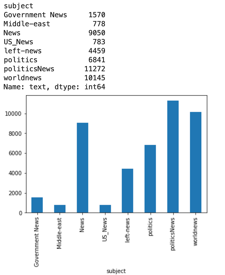
How many articles per subject?
print(data.groupby(['subject'])['text'].count())
data.groupby(['subject'])['text'].count().plot(kind="bar")
plt.show()
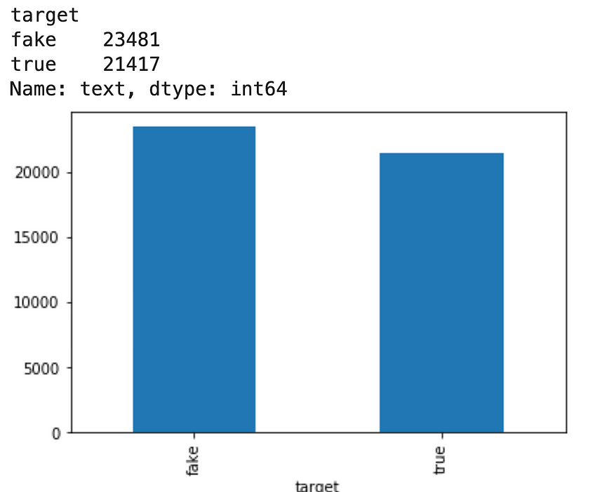
How many fake and real articles?
print(data.groupby([‘target’])[‘text’].count())
data.groupby([‘target’])[‘text’].count().plot(kind=”bar”)
plt.show()
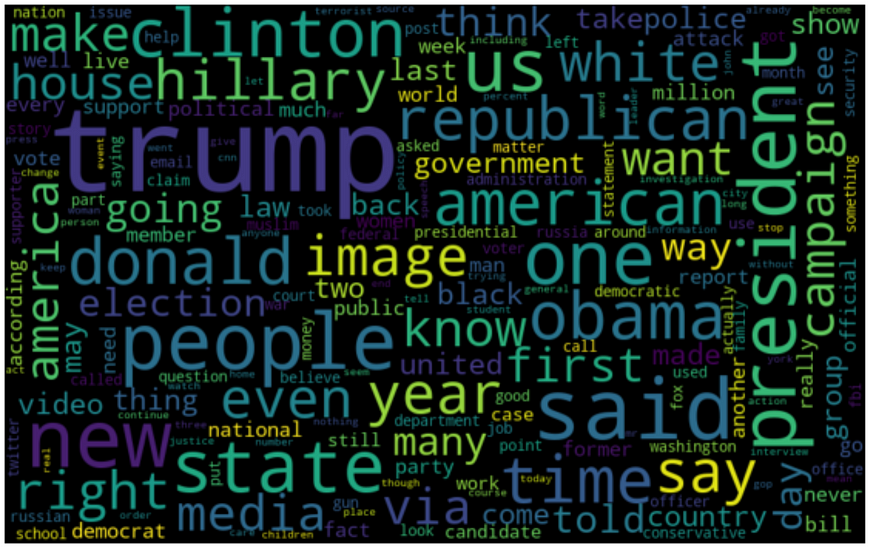
Word Cloud for fake news:
from wordcloud import WordCloudfake_data = data[data["target"] == "fake"]
all_words = ' '.join([text for text in fake_data.text])wordcloud = WordCloud(width= 800, height= 500,
                          max_font_size = 110,
                          collocations = False).generate(all_words)plt.figure(figsize=(10,7))
plt.imshow(wordcloud, interpolation='bilinear')
plt.axis("off")
plt.show()
Word Cloud for real news:
from wordcloud import WordCloudreal_data = data[data[“target”] == “true”]
all_words = ‘ ‘.join([text for text in fake_data.text])wordcloud = WordCloud(width= 800, height= 500, max_font_size = 110,
 collocations = False).generate(all_words)plt.figure(figsize=(10,7))
plt.imshow(wordcloud, interpolation=’bilinear’)
plt.axis(“off”)
plt.show()
Most frequent words function:
# Most frequent words counter (Code adapted from https://www.kaggle.com/rodolfoluna/fake-news-detector)
from nltk import tokenizetoken_space = tokenize.WhitespaceTokenizer()def counter(text, column_text, quantity):
    all_words = ' '.join([text for text in text[column_text]])
    token_phrase = token_space.tokenize(all_words)
    frequency = nltk.FreqDist(token_phrase)
    df_frequency = pd.DataFrame({"Word": list(frequency.keys()),
                                   "Frequency": list(frequency.values())})
    df_frequency = df_frequency.nlargest(columns = "Frequency", n = quantity)
    plt.figure(figsize=(12,8))
    ax = sns.barplot(data = df_frequency, x = "Word", y = "Frequency", color = 'blue')
    ax.set(ylabel = "Count")
    plt.xticks(rotation='vertical')
    plt.show()
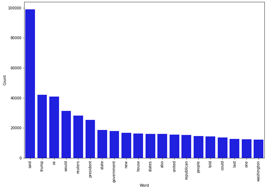
Most frequent words in fake news:
counter(data[data[“target”] == “fake”], “text”, 20)
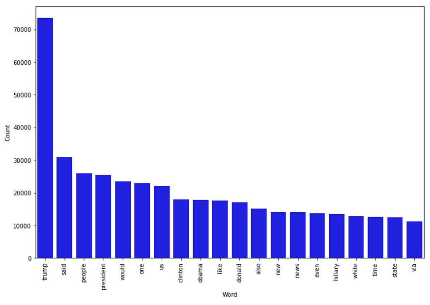
Most frequent words in real news:
counter(data[data[“target”] == “true”], “text”, 20)
Modeling
The modeling process will consist of vectorizing the corpus stored in the “text” column, then applying TF-IDF, and finally a classification machine learning algorithm. Pretty standard in text analytics and NLP.
For modeling, we have this function to plot the confusion matrix of the models:
# Function to plot the confusion matrix (code from https://scikit-learn.org/stable/auto_examples/model_selection/plot_confusion_matrix.html)
from sklearn import metrics
import itertoolsdef plot_confusion_matrix(cm, classes,
                          normalize=False,
                          title='Confusion matrix',
                          cmap=plt.cm.Blues):

    plt.imshow(cm, interpolation='nearest', cmap=cmap)
    plt.title(title)
    plt.colorbar()
    tick_marks = np.arange(len(classes))
    plt.xticks(tick_marks, classes, rotation=45)
    plt.yticks(tick_marks, classes)if normalize:
        cm = cm.astype('float') / cm.sum(axis=1)[:, np.newaxis]
        print("Normalized confusion matrix")
    else:
        print('Confusion matrix, without normalization')thresh = cm.max() / 2.
    for i, j in itertools.product(range(cm.shape[0]), range(cm.shape[1])):
        plt.text(j, i, cm[i, j],
                 horizontalalignment="center",
                 color="white" if cm[i, j] > thresh else "black")plt.tight_layout()
    plt.ylabel('True label')
    plt.xlabel('Predicted label')
Split the data:
X_train,X_test,y_train,y_test = train_test_split(data['text'], data.target, test_size=0.2, random_state=42)
Logistic regression:
# Vectorizing and applying TF-IDF
from sklearn.linear_model import LogisticRegressionpipe = Pipeline([('vect', CountVectorizer()),
                 ('tfidf', TfidfTransformer()),
                 ('model', LogisticRegression())])# Fitting the model
model = pipe.fit(X_train, y_train)# Accuracy
prediction = model.predict(X_test)
print("accuracy: {}%".format(round(accuracy_score(y_test, prediction)*100,2)))
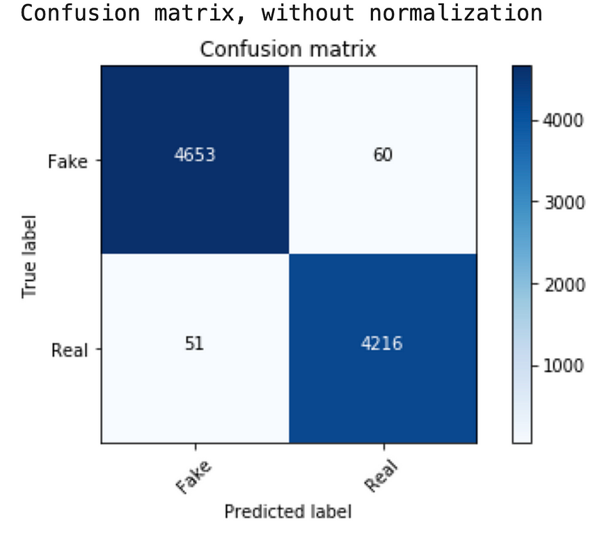
I got an accuracy of 98.76%. The confusion matrix:
cm = metrics.confusion_matrix(y_test, prediction)
plot_confusion_matrix(cm, classes=['Fake', 'Real'])
Decision Tree Classifier:
from sklearn.tree import DecisionTreeClassifier# Vectorizing and applying TF-IDF
pipe = Pipeline([('vect', CountVectorizer()),
                 ('tfidf', TfidfTransformer()),
                 ('model', DecisionTreeClassifier(criterion= 'entropy',
                                           max_depth = 20,
                                           splitter='best',
                                           random_state=42))])
# Fitting the model
model = pipe.fit(X_train, y_train)# Accuracy
prediction = model.predict(X_test)
print("accuracy: {}%".format(round(accuracy_score(y_test, prediction)*100,2)))
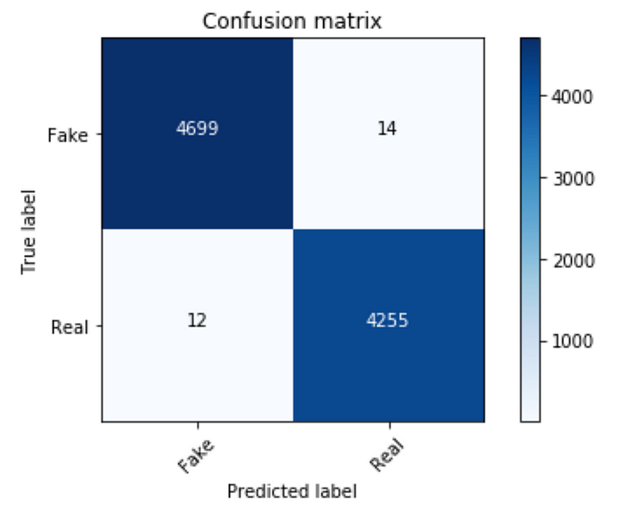
I got an accuracy of 99.71 %. The confusion matrix:
cm = metrics.confusion_matrix(y_test, prediction)
plot_confusion_matrix(cm, classes=['Fake', 'Real'])
Random Forest Classifier:
from sklearn.ensemble import RandomForestClassifierpipe = Pipeline([('vect', CountVectorizer()),
                 ('tfidf', TfidfTransformer()),
                 ('model', RandomForestClassifier(n_estimators=50, criterion="entropy"))])model = pipe.fit(X_train, y_train)
prediction = model.predict(X_test)
print("accuracy: {}%".format(round(accuracy_score(y_test, prediction)*100,2)))
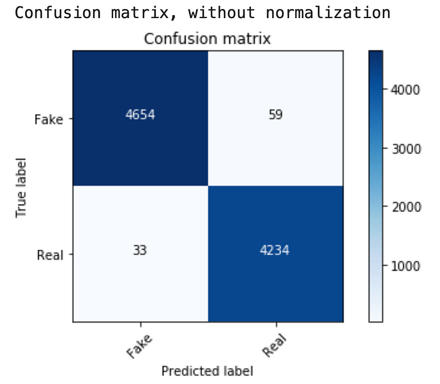
I got an accuracy of 98.98 %. The confusion matrix:
cm = metrics.confusion_matrix(y_test, prediction)
plot_confusion_matrix(cm, classes=['Fake', 'Real'])
Solving the problem without coding
We have a pretty good model with Python. Now it’s time to do the same (or as much as possible) without coding. Again, we will be using a system called LEAPS for that. There’s a lot of things to do with it, and I don’t want to copy 15 screenshots on how to do it. So I’ll only put the most important pieces.
Important: To be able to use some of the functions you will need to select at least one column of the dataset. If you want to know more about how to use the platform check their free courses here.
Here’s how to do it:
-
- Create a free account
- Create a new project
- Upload the data: You have to upload each dataset separately, then rename the “fake.csv” to Fake and the “true.csv” to True. It’s a simple process in the platform.
- Create a column named “target” in both the Fake and True datasets. For the Fake, it should be a constant value of 0 and for the True, it should be a constant value of 1. Go to Functions -> Data Management -> Column Operations -> Generate Constant Column (Py). Note: You have to select all the columns in the dataset to perform this operation. After creating the column you have to rename it to “target”.
- Append both tables and create a complete one with fake and true tweets. Make sure to select all the columns before doing the append. You can find the operation append in Functions -> Data Management ->Table Operations -> Append Tables. Rename the new table “All”. Note: You have to select all the columns from the two datasets to perform the Append Tables operation.
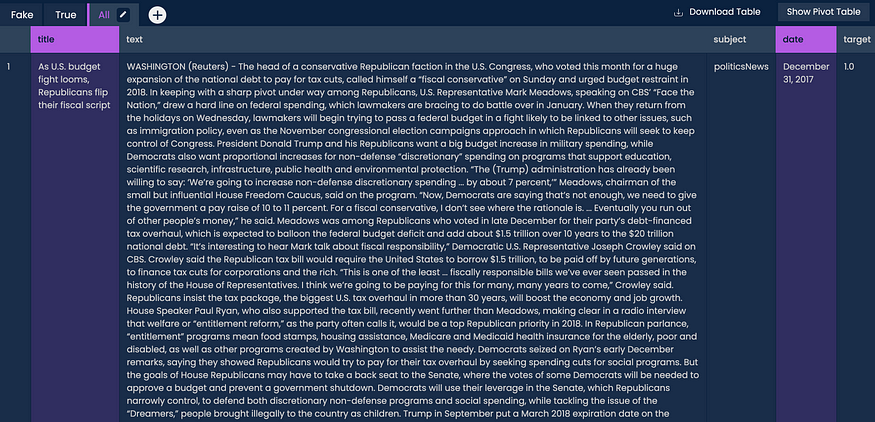
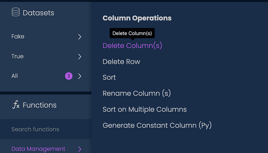
- Remove the columns “date” and “title”. For that first select them and then go to Functions -> Data Management -> Column Operations -> Delete Column (s):
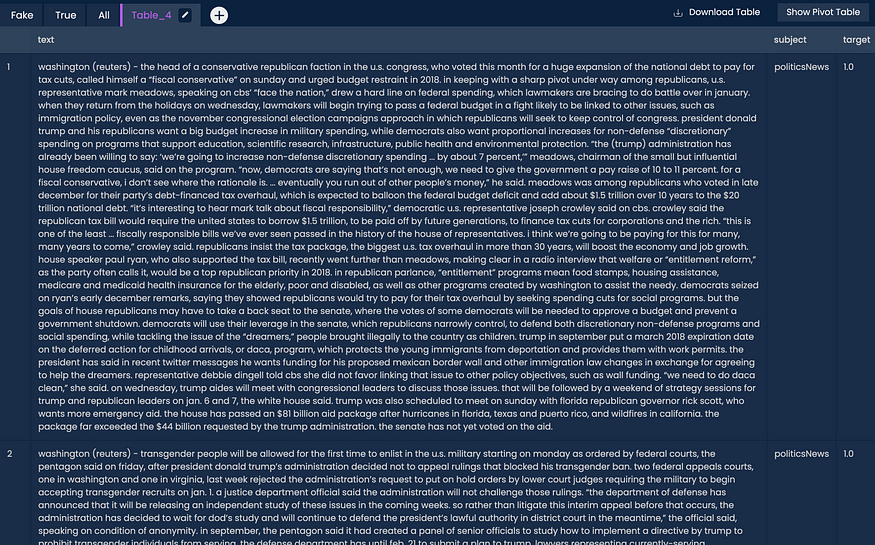
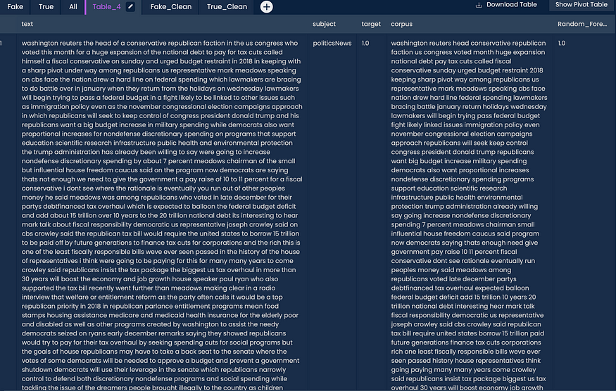
- The last step created a new table, that in my case was named “Table_4”. We will work on that table for now. We will now, transform the column “text” to all lowercase. For that, we select the column, and then we go to Functions -> Text Analytics -> Text Pre-Processing -> To Lower Case. You should have this:
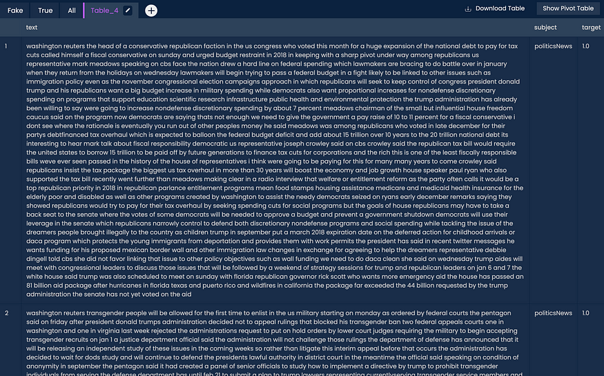
- We will now remove punctuation. To do that go to Functions -> Text Analytics -> Text Pre-Processing -> Remove Punctuations. You should be seeing this:
- Let’s create a corpus to work on the next steps. To do that go to Functions -> Text Analytics -> Text Pre-Processing -> Build Corpus. Let’s also rename the final column to “corpus”.
- Finally, let’s remove the stopwords (In the “corpus” column”). To do that go to Functions -> Text Analytics -> Text Pre-Processing -> Remove Words. This will remove the words based on some Python and R libraries, but you can define more words to be eliminated here. This is what you should have by this point:
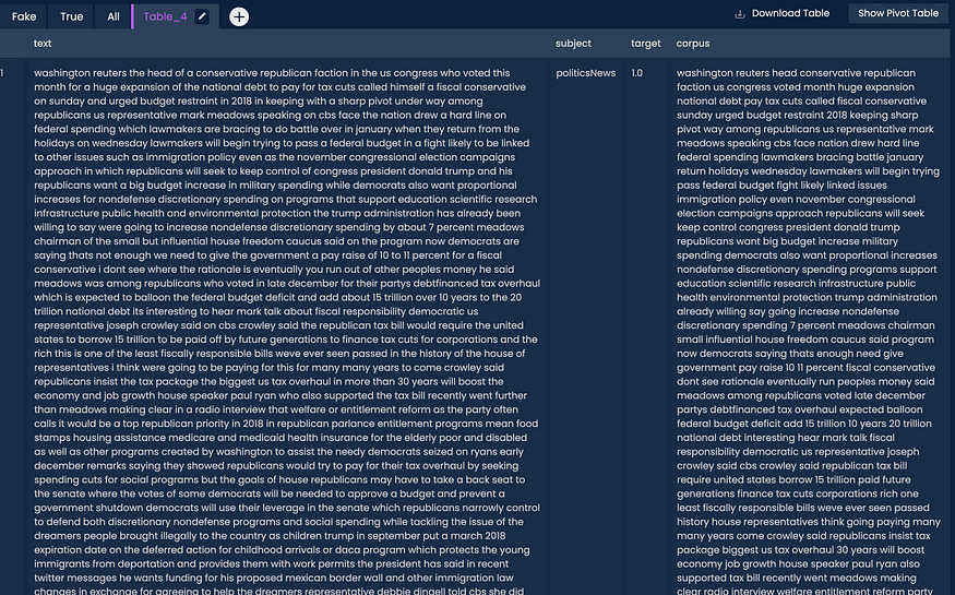
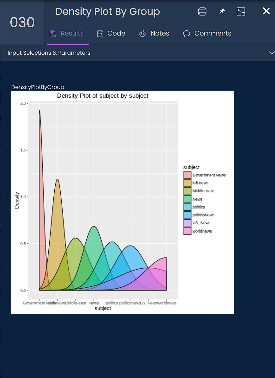
- Let’s replicate some plots and statistics from the Python part. First: How many articles per subject? We have to select the “subject” column, and then go to Functions -> Data Visualization -> Distribution Charts -> Density Plot by Group (Py). This is the most similar chart I could get for this. The result:
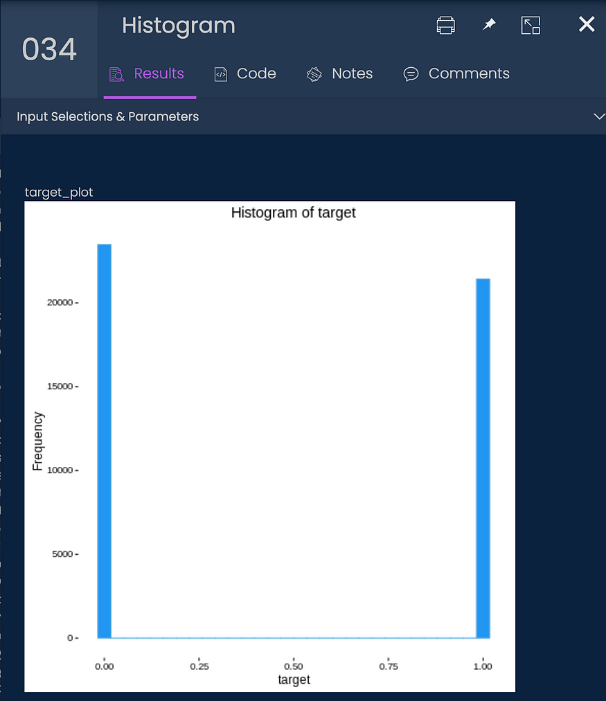
- Now let’s see how many “fake” and “real” articles we have in a chart. For that go to Functions -> Data Visualization -> Distribution Charts -> Histogram. This is what I got:
- Let’s build the word clouds now. For that, I had first to separate again the data for “fake” and “true” articles. To do it (selecting the “target” columns) go to Functions -> Data Management -> Data Sampling / Subsetting -> Filter Categorical. I did it for the “fake” ones and created a table that I named “Fake_Clean” and then for the “true” ones and created a table called “True_Clean”. Then I created the word cloud for both corpora (plural of corpus). To create a word cloud go to Functions -> Text Analytics -> Information Retrieval -> Word Cloud selecting the “corpus” column. Note: In the end, I used the Word Cloud by Class, and selected “target” as a class. The results are the same.
This is what I got for the “fake” articles:
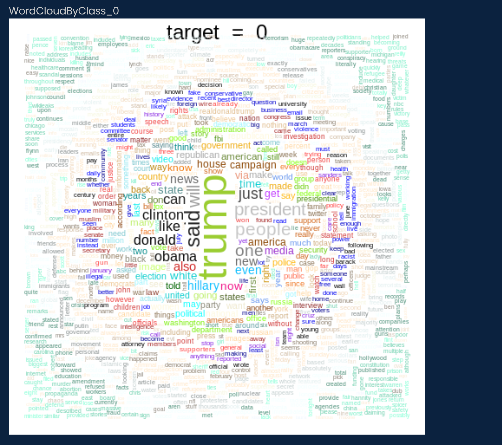
And this for the “true” articles:
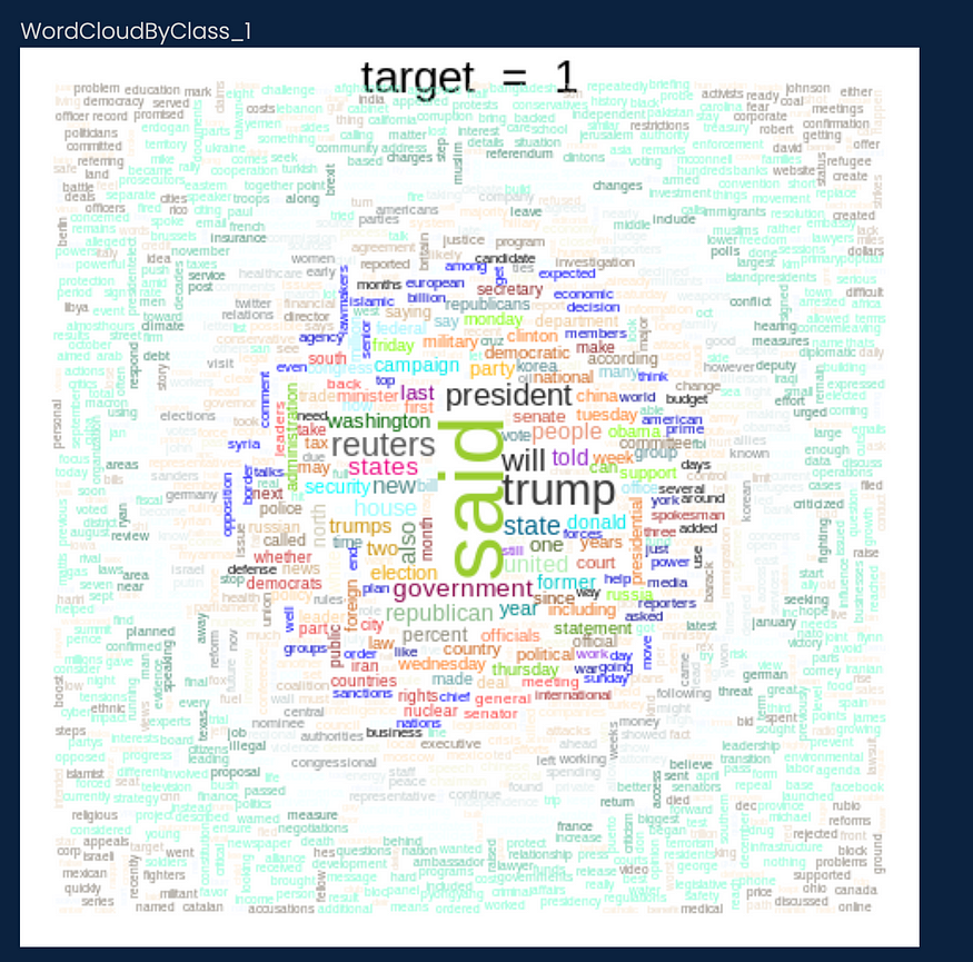
Pretty similar to the Python results.
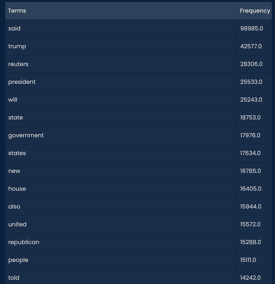
- Then I plotted the most common words for “fake” and “true” articles. For that go to Functions -> Text Analytics -> Information Retrieval -> Frequent Terms. For the “true” articles I got:
 and for the “fake” articles I got:
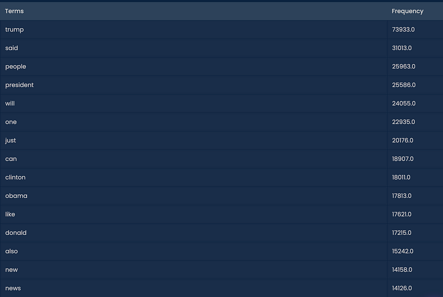
Again pretty similar to what we got in the Python part.
- For the ML part, let’s start with a Random Forest Classifier. I went to Functions -> Text Analytics -> Text Classification -> Random Forest Classification (Py) with this configuration (selecting the “target” and “corpus” variables):
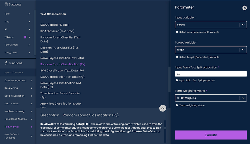
This will tokenize and then use TF-IDF as a weighting metric. This is the result:
- For the ML part, let’s start with a Random Forest Classifier. I went to Functions -> Text Analytics -> Text Classification -> Random Forest Classification (Py) with this configuration (selecting the “target” and “corpus” variables):
You will get a new column with the results for your model. It’s very simple. You can now download the final dataset with the model if you want to get the metrics in Python or somewhere else. The same process can be done for other models like:
- Decision Tree Classification
- SVM Classification
- Gaussian Naive-Bayes Classification
and more! You can even compare the models with the Compare Text Classification Models. Also, you can test other models like sentiment analysis, text clustering, Word2Vec, and more.
Conclusions
Text analytics and NLP can be used to work with the very important problem of fake news. We have seen the big impact they can have on people’s opinions, and the way the world thinks or sees a topic.
This article has been published from the source link without modifications to the text. Only the headline has been changed.


