Model Evaluation
Model Evaluation is an integral part of the model development process. It helps to find the best model that represents our data and how well the chosen model will work in the future. Evaluating model performance with the data used for training is not acceptable in data science because it can easily generate overoptimistic and overfitted models. There are two methods of evaluating models in data science, Hold-Out and Cross-Validation. To avoid overfitting, both methods use a test set (not seen by the model) to evaluate model performance.
Hold-Out
- Training set is a subset of the dataset used to build predictive models.
- Validation set is a subset of the dataset used to assess the performance of model built in the training phase. It provides a test platform for fine tuning model’s parameters and selecting the best-performing model. Not all modeling algorithms need a validation set.
- Test set or unseen examples is a subset of the dataset to assess the likely future performance of a model. If a model fit to the training set much better than it fits the test set, overfitting is probably the cause.
Cross-Validation
When only a limited amount of data is available, to achieve an unbiased estimate of the model performance we use k-fold cross-validation. In k-fold cross-validation, we divide the data into k subsets of equal size. We build models k times, each time leaving out one of the subsets from training and use it as the test set. If k equals the sample size, this is called “leave-one-out”.
Model evaluation can be divided to two sections:
- Classification Evaluation
- Regression Evaluation
Model Evaluation – Classification
Confusion Matrix
A confusion matrix shows the number of correct and incorrect predictions made by the classification model compared to the actual outcomes (target value) in the data. The matrix is NxN, where N is the number of target values (classes). Performance of such models is commonly evaluated using the data in the matrix. The following table displays a 2×2 confusion matrix for two classes (Positive and Negative).
|
|||||||||||||||||||||||||
- Accuracy : the proportion of the total number of predictions that were correct.
- Positive Predictive Value or Precision : the proportion of positive cases that were correctly identified.
- Negative Predictive Value : the proportion of negative cases that were correctly identified.
- Sensitivity or Recall : the proportion of actual positive cases which are correctly identified.
- Specificity : the proportion of actual negative cases which are correctly identified.
Example:
| Confusion Matrix | Target | ||||
| Positive | Negative | ||||
| Model | Positive | 70 | 20 |
Positive Predictive Value |
0.78 |
| Negative | 30 | 80 |
Negative Predictive Value |
0.73 | |
| Sensitivity | Specificity |
Accuracy = 0.75 |
|||
Gain and Lift Charts
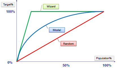
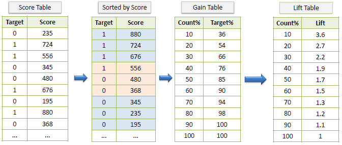
Gain or lift is a measure of the effectiveness of a classification model calculated as the ratio between the results obtained with and without the model. Gain and lift charts are visual aids for evaluating performance of classification models. However, in contrast to the confusion matrix that evaluates models on the whole population gain or lift chart evaluates model performance in a portion of the population.
Example:
Gain Chart
Lift Chart
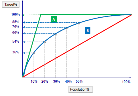
The lift chart shows how much more likely we are to receive positive responses than if we contact a random sample of customers. For example, by contacting only 10% of customers based on the predictive model we will reach 3 times as many respondents, as if we use no model.
K-S Chart
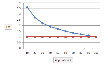
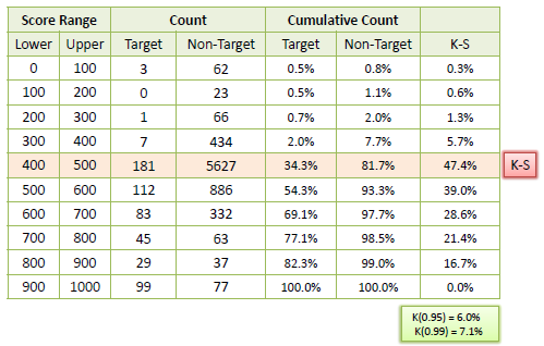
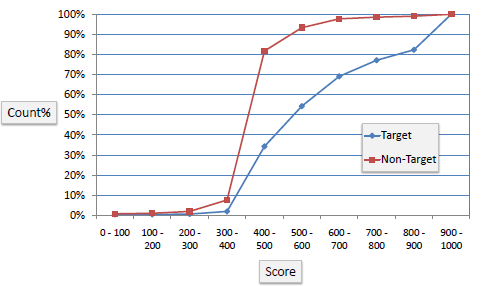
K-S or Kolmogorov-Smirnov chart measures performance of classification models. More accurately, K-S is a measure of the degree of separation between the positive and negative distributions. The K-S is 100 if the scores partition the population into two separate groups in which one group contains all the positives and the other all the negatives. On the other hand, If the model cannot differentiate between positives and negatives, then it is as if the model selects cases randomly from the population. The K-S would be 0. In most classification models the K-S will fall between 0 and 100, and that the higher the value the better the model is at separating the positive from negative cases.
Example:
The following example shows the results from a classification model. The model assigns a score between 0-1000 to each positive (Target) and negative (Non-Target) outcome.
ROC Chart
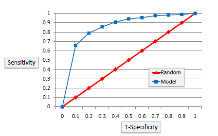
The ROC chart is similar to the gain or lift charts in that they provide a means of comparison between classification models. The ROC chart shows false positive rate (1-specificity) on X-axis, the probability of target=1 when its true value is 0, against true positive rate (sensitivity) on Y-axis, the probability of target=1 when its true value is 1. Ideally, the curve will climb quickly toward the top-left meaning the model correctly predicted the cases. The diagonal red line is for a random model (ROC101).
Area Under the Curve (AUC)
Area under ROC curve is often used as a measure of quality of the classification models. A random classifier has an area under the curve of 0.5, while AUC for a perfect classifier is equal to 1. In practice, most of the classification models have an AUC between 0.5 and 1.
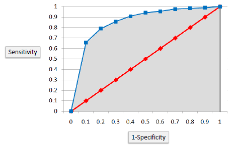
An area under the ROC curve of 0.8, for example, means that a randomly selected case from the group with the target equals 1 has a score larger than that for a randomly chosen case from the group with the target equals 0 in 80% of the time. When a classifier cannot distinguish between the two groups, the area will be equal to 0.5 (the ROC curve will coincide with the diagonal). When there is a perfect separation of the two groups, i.e., no overlapping of the distributions, the area under the ROC curve reaches to 1 (the ROC curve will reach the upper left corner of the plot).
Model Evaluation – Regression
After building a number of different regression models, there is a wealth of criteria by which they can be evaluated and compared.
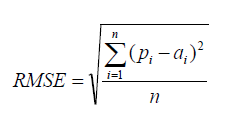
Root Mean Squared Error
RMSE is a popular formula to measure the error rate of a regression model. However, it can only be compared between models whose errors are measured in the same units.

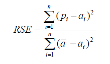
Relative Squared Error
Unlike RMSE, the relative squared error (RSE) can be compared between models whose errors are measured in the different units.
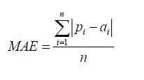
Mean Absolute Error
The mean absolute error (MAE) has the same unit as the original data, and it can only be compared between models whose errors are measured in the same units. It is usually similar in magnitude to RMSE, but slightly smaller.
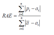
Relative Absolute Error
Like RSE , the relative absolute error (RAE) can be compared between models whose errors are measured in the different units.
Coefficient of Determination
The coefficient of determination (R2) summarizes the explanatory power of the regression model and is computed from the sums-of-squares terms.
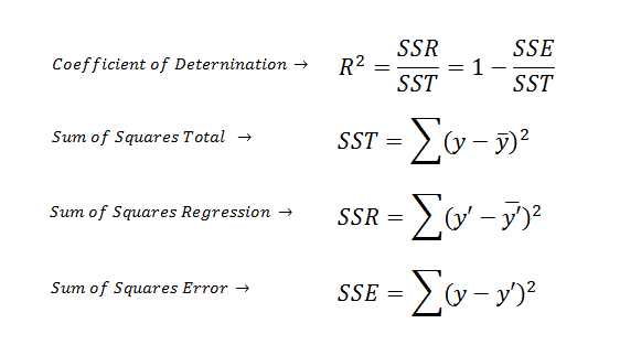
R2 describes the proportion of variance of the dependent variable explained by the regression model. If the regression model is “perfect”, SSE is zero, and R2 is 1. If the regression model is a total failure, SSE is equal to SST, no variance is explained by regression, and R2 is zero.
Standardized Residuals (Errors) Plot
The standardized residual plot is a useful visualization tool in order to show the residual dispersion patterns on a standardized scale. There are no substantial differences between the pattern for a standardized residual plot and the pattern in the regular residual plot. The only difference is the standardized scale on the y-axis which allows us to easily detect potential outliers.
This article has been published from the source link without modification to the text. Only the headline has been changed.


